Task 4
Contents
Task 4#
4.1 - Visualization#
4.1.1 - Scatter Chart#
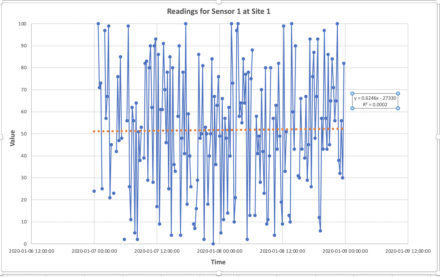
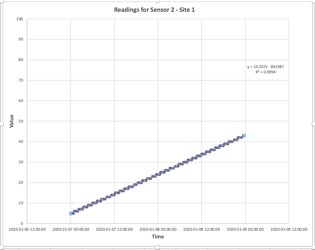
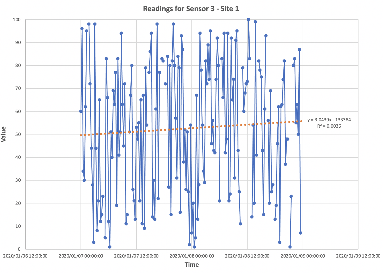
Create three separate XY Scatter charts (with smooth lines and markers) on a sheet called chart that shows the readings by time for:
sensor 1 at site 1. Add an appropriate trendline for sensor 1 at site 1.
sensor 2 at site 2. Add an appropriate trendline for sensor 2 at site 1.
sensor 3 at site 1. Add an appropriate trendline for sensor 3 at sire 1.
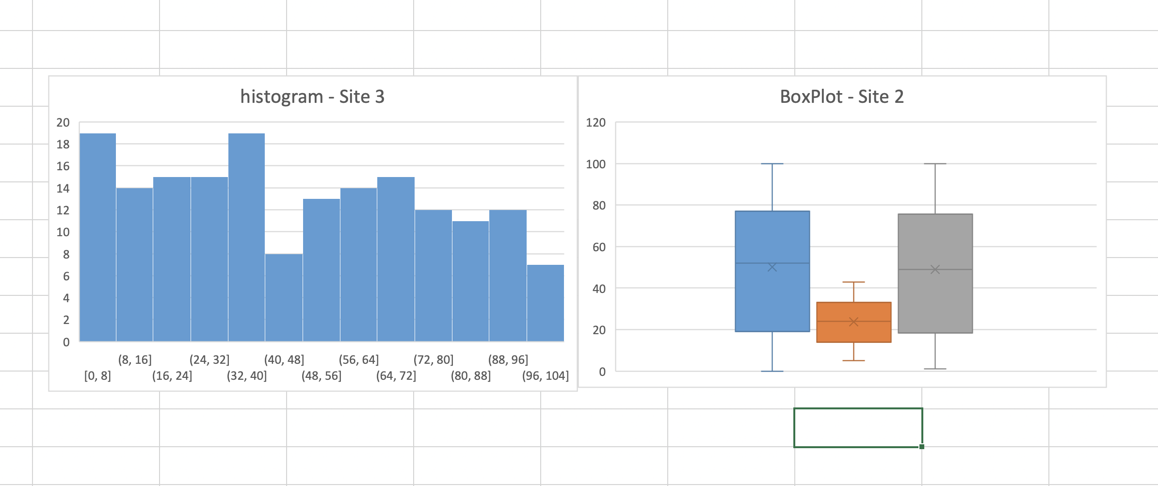
4.1.2 - Histogram#
Using all the data from site 3, make a histogram to show the overall distribution of the data(you can use bin size of 10)
4.1.3 - Box Plot#
Use a box plot to show the distribution of data from site 2 for each sensor separately.
histogram and boxplot charts#
Screenshot provided below of Histogram and Boxplot for guidance:
Note that your plots may not look exactly the same but this is generally what we’re looking for.
SUBMISSION DETAILS:#
Submit screenshot(s) of all three scatter plots (i.e Sensor 1, Sensor 2 and Sensor 3 at Site 1). Try to fit all three in one screenshot.
Submit ONE screenshot of the Histogram and Boxplot as shown below: