Task 2. Bar Charts in Tableau.
Contents
Task 2. Bar Charts in Tableau.#
2.1. Tree count#
Make a new worksheet called B1 by going to the menu bar under “Worksheet” and clicking “New Worksheet” (Or Command+T on a Mac, Ctrl+T on Windows).
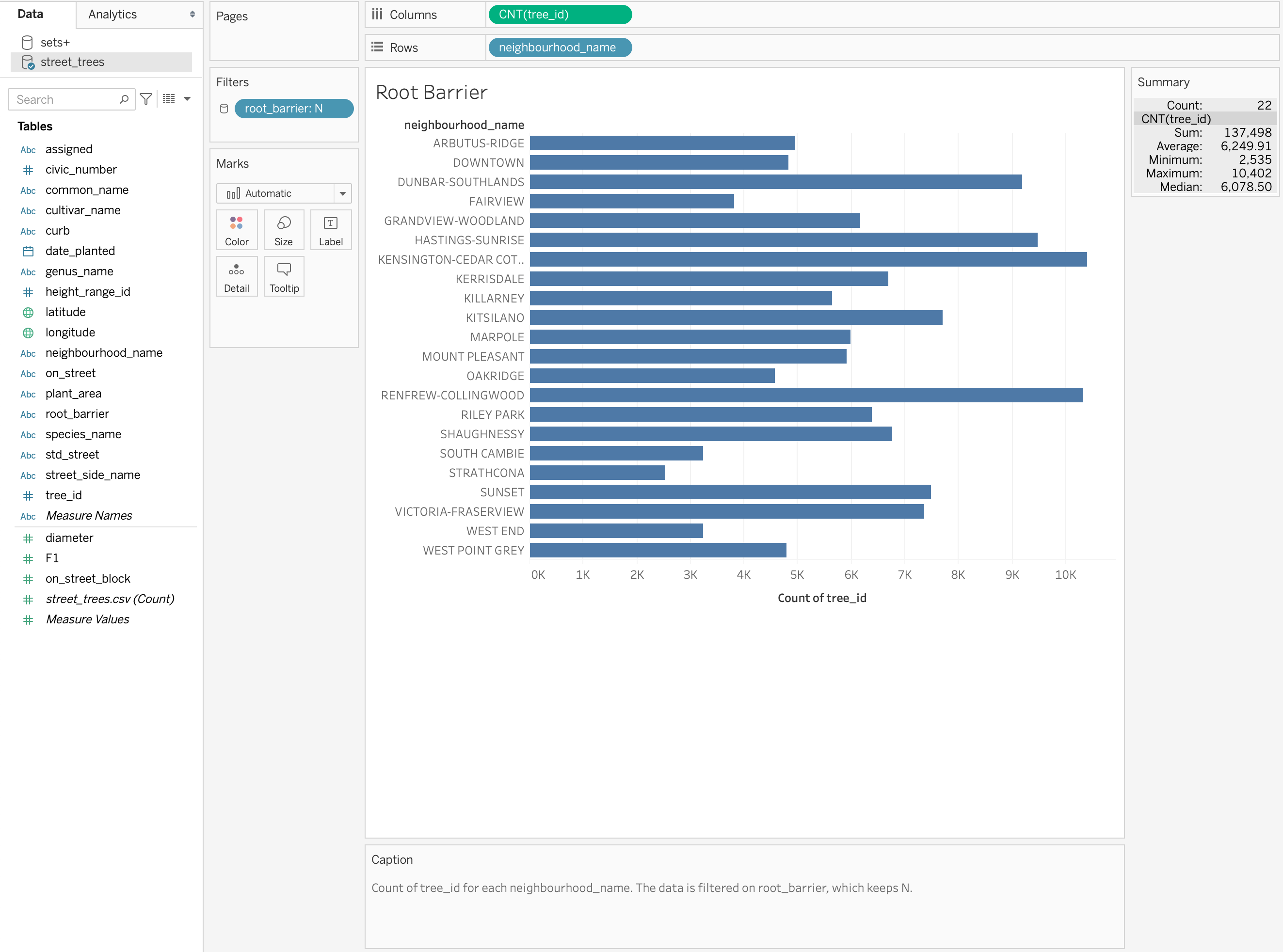
We are going to make a bar chart for the number of trees in each neighbourhood.
Instructions#
Since we are interested in the neighbourhood, we are going to drag from the left-hand side under the heading “Tables” the column named
neighbourhood_nameto the “Column” toolbar.We are interested in the count of the trees in each neighbourhood, so I like to use the index to count the rows but you can use multiple different columns here. Drag the
tree_idto the “Rows” toolbar.We need to convert this variable to a “Measure” specifically a “Count”. We can do this by right-clicking on it.
Voila! A bar chart!
Let’s change the colour. Go to the mark card and select a new colour.
Let’ edit our y-axis label. Right-click on the axis and click “Edit Axis…” Under “Axis”, you can edit your axis “Title”.
You can edit the title in two ways by editing the sheet name or by editing the title. I prefer to edit the sheet name by double-clicking the sheet at the bottom.
You can sort the bars by clicking the icon beside the axis title.
Let’s convert it to a verticle bar chart. On the toolbar right above “Columns” you’ll see a “Swap rows and columns” icon. This transposes your graph so the x and y-axes are flipped (remember keep your text description values on the y-axis so you don’t have to turn your head to read them.
Sample Output#
2.2. Tree diameter#
Create a new sheet called B2 and plot the average diameter of the tree trunks of each genus_name type.
This is very similar to how you would make a bar plot with one minor difference we no longer are using a “Count” “Measure” but instead perhaps “Average”, “Median”, “Max” or “Min”.
Instructions#
Drag from the left-hand side under the heading “Tables” the column named
genus_typeto the “Column” toolbar.We want the mean diameter for each genus so we can drag
diameterto the “Rows” toolbar.This is where things differ. We right click the
diameterand transform the “Measure” to “Average”.Instead of using a bar chart, trying a dot plot would be more ideal. We can convert it by clicking the dropdown menu under the “Marks” card. Selecting “Circle” or “Shape” will instantly convert it.
💡You can add your own shape icons by adding a folder to your “My Tableau Repository” folder under “Shapes”
Sample Output#