Seaborn Tutorial
Contents
Seaborn Tutorial#
This tutorial notebook is an accompaniment to the Derek Banas’ excellent tour of the Seaborn visualization package. The original notebook is currently hosted here on GitHub.
Seaborn is a data visualization library built on top of Matplotlib. It is often used because it makes attractive visualizations and works easily with Pandas. While in Matplotlib you often had to write multiple lines of code to create a plot Seaborn makes assumptions on what you want which often translates into getting the same plot with 1 line of code.
Reminder: Shift + Tab after attribute to see options.
Installing Seaborn#
You can install it using the conda:
matplotlib is a Python library for data visualization. seaborn is a statistical data visualization library layer that provides a high-level interface for drawing statistical graphics and some convenient functions for plotting data frames.
You may need to install seaborn and matplotlib
conda install seaborn
conda install matplotlib
and just in case it’s not the latest version, go ahead and update it:
conda update matplotlib
conda update seaborn
import modules#
import numpy as np
import pandas as pd
import matplotlib.pyplot as plt
import seaborn as sns

#%matplotlib inline

# Some code to style plots

import matplotlib.pyplot as plt
import seaborn as sns
Setting the themes and styles#
# There are five preset seaborn themes: darkgrid, whitegrid, dark, white, and ticks.
# They are each suited to different applications and personal preferences.
# You can see what they look like [here](https://seaborn.pydata.org/tutorial/aesthetics.html#seaborn-figure-styles)

# Just for fun, we're going to set the theme to be a nice one:
sns.set_theme(style="ticks",
              font_scale=1.3, # This scales the fonts slightly higher
             )
# And we're going to remove the top and right axis lines
plt.rc("axes.spines", top=False, right=False)
Loading Data#
# Seaborn provides built in datasets
print(sns.get_dataset_names())

# Load a built in dataset based on US State car crash percentages
crash_df = sns.load_dataset('car_crashes')
['anagrams', 'anscombe', 'attention', 'brain_networks', 'car_crashes', 'diamonds', 'dots', 'dowjones', 'exercise', 'flights', 'fmri', 'geyser', 'glue', 'healthexp', 'iris', 'mpg', 'penguins', 'planets', 'seaice', 'taxis', 'tips', 'titanic']
Distribution Plots#
Distribution Plot#
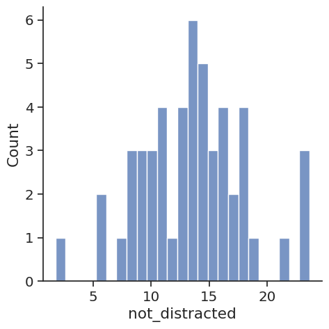
# Provides a way to look at a univariate distribution. A
# univeriate distribution provides a distribution for one variable
# Kernal Density Estimation with a Histogram is provided
# kde=False removes the KDE
# Bins define how many buckets to divide the data up into between intervals
# For example put all profits between $10 and $20 in this bucket

sns.displot(crash_df['not_distracted'], kde=False, bins=25)
<seaborn.axisgrid.FacetGrid at 0x7f250dc59f90>
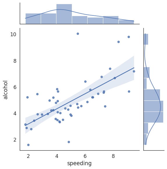
Joint Plot#
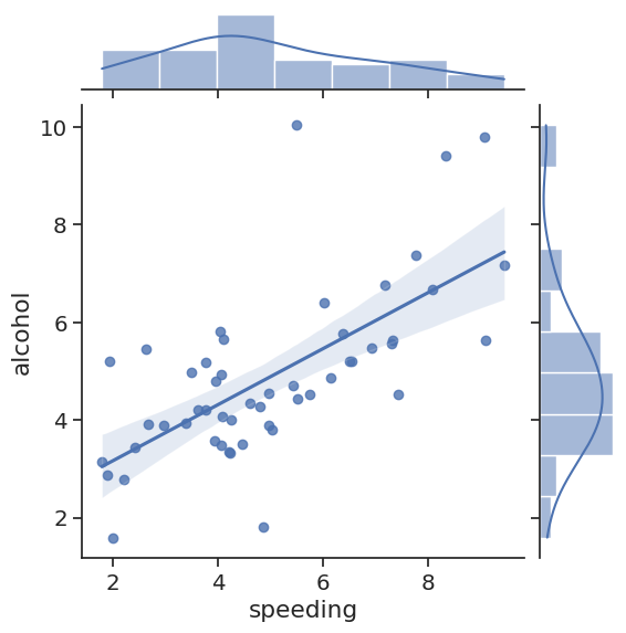
# Jointplot compares 2 distributions and plots a scatter plot by default
# As we can see as people tend to speed they also tend to drink & drive
# With kind you can create a regression line with kind='reg'
# You can create a 2D KDE with kind='kde'
# Kernal Density Estimation estimates the distribution of data
# You can create a hexagon distribution with kind='hex'
sns.jointplot(x='speeding', y='alcohol', data=crash_df, kind='reg')
<seaborn.axisgrid.JointGrid at 0x7f250db6b190>
KDE Plot#
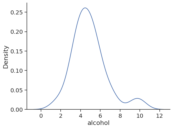
# Get just the KDE plot
sns.kdeplot(crash_df['alcohol'])
<AxesSubplot: xlabel='alcohol', ylabel='Density'>
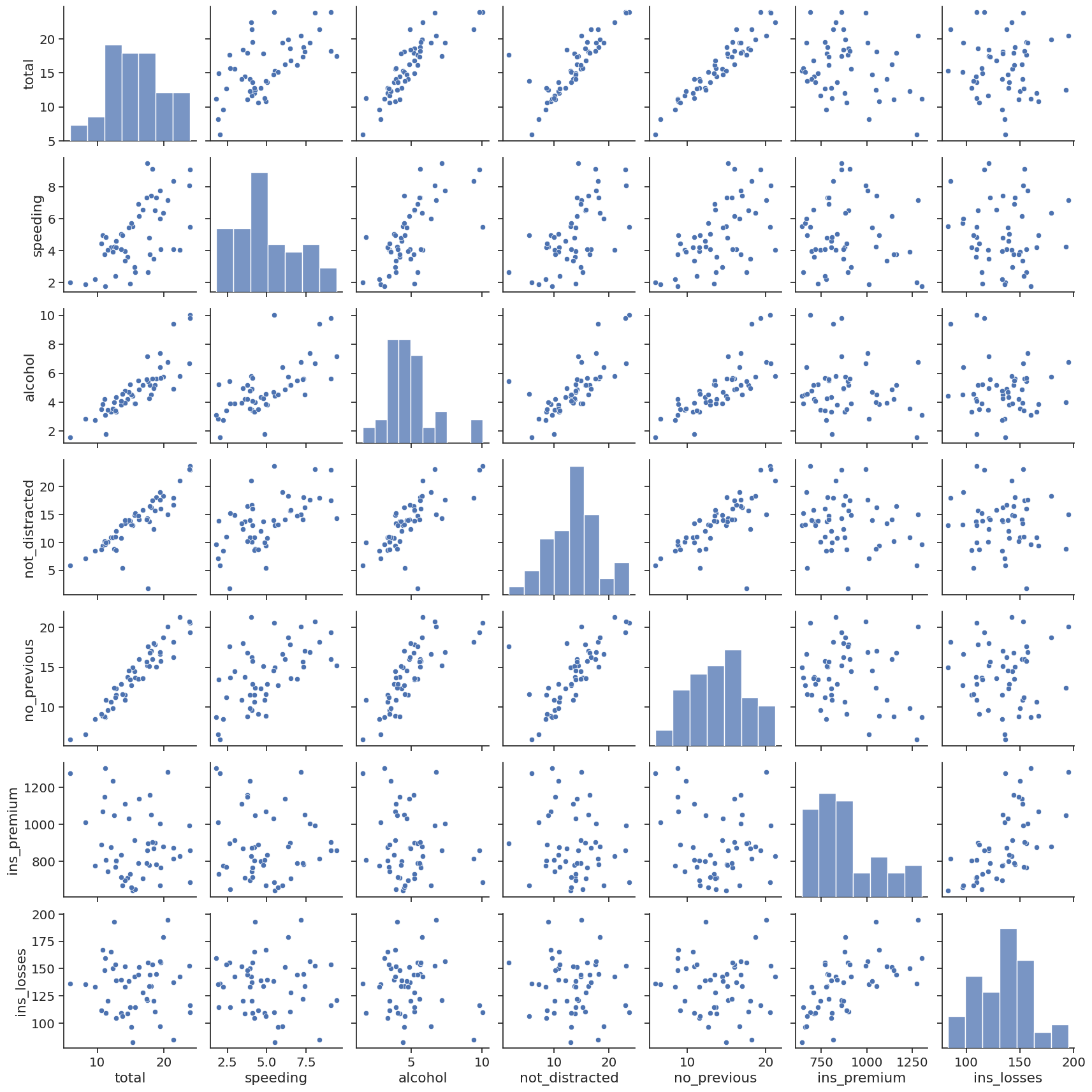
Pair Plots#
# Pair Plot plots relationships across the entire data frames numerical values
sns.pairplot(crash_df)

# Load data on tips
tips_df = sns.load_dataset('tips')

# With hue you can pass in a categorical column and the charts will be colorized
# You can use color maps from Matplotlib to define what colors to use
# sns.pairplot(tips_df, hue='sex', palette='Blues')
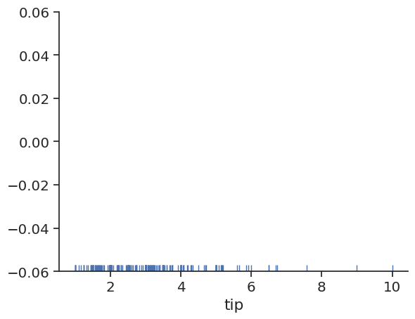
Rug Plots#
# Plots a single column of datapoints in an array as sticks on an axis
# With a rug plot you'll see a more dense number of lines where the amount is
# most common. This is like how a histogram is taller where values are more common
sns.rugplot(tips_df['tip'])
<AxesSubplot: xlabel='tip'>
Styling#
# You can set styling for your axes and grids
# white, darkgrid, whitegrid, dark, ticks
sns.set_style('white')

# You can use figure sizing from Matplotlib
plt.figure(figsize=(8,4))

# Change size of lables, lines and other elements to best fit
# how you will present your data (paper, talk, poster)
sns.set_context('paper', font_scale=1.4)

sns.jointplot(x='speeding', y='alcohol', data=crash_df, kind='reg')

# Get rid of spines
# You can turn of specific spines with right=True, left=True
# bottom=True, top=True
sns.despine(left=False, bottom=False)
<Figure size 800x400 with 0 Axes>
Categorical Plots#
Bar Plots#
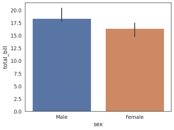
# Focus on distributions using categorical data in reference to one of the numerical
# columns

# Aggregate categorical data based on a function (mean is the default)
# Estimate total bill amount based on sex
# With estimator you can define functions to use other than the mean like those
# provided by NumPy : median, std, var, cov or make your own functions
sns.barplot(x='sex',y='total_bill',data=tips_df, estimator=np.median)
<AxesSubplot: xlabel='sex', ylabel='total_bill'>
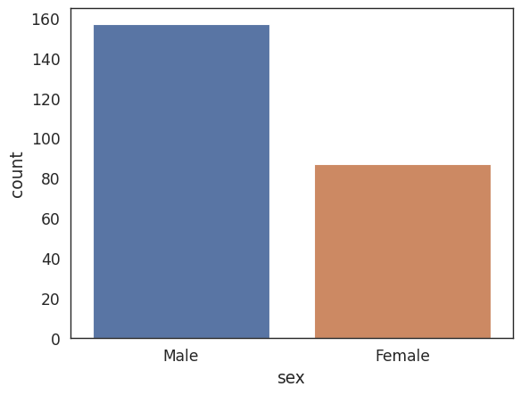
Count Plot#
# A count plot is like a bar plot, but the estimator is counting
# the number of occurances
sns.countplot(x='sex',data=tips_df)
<AxesSubplot: xlabel='sex', ylabel='count'>
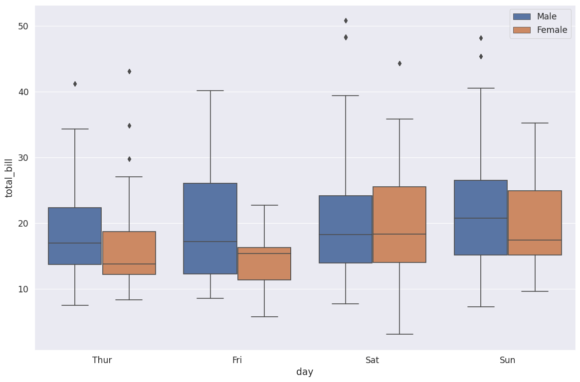
Box Plot#
plt.figure(figsize=(14,9))
sns.set_style('darkgrid')

# A box plot allows you to compare different variables
# The box shows the quartiles of the data. The bar in the middle is the median and
# the box extends 1 standard deviation from the median
# The whiskers extend to all the other data aside from the points that are considered
# to be outliers
# Hue can add another category being sex
# We see men spend way more on Friday versus less than women on Saturday
sns.boxplot(x='day',y='total_bill',data=tips_df, hue='sex')

# Moves legend to the best position
plt.legend(loc=0)
<matplotlib.legend.Legend at 0x7f2504a9bb80>
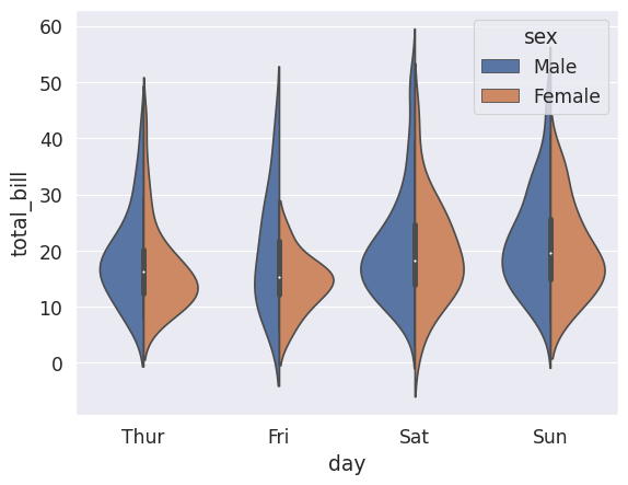
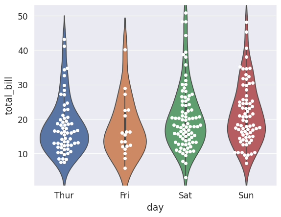
Violin Plot#
# Violin Plot is a combination of the boxplot and KDE
# While a box plot corresponds to data points, the violin plot uses the KDE estimation
# of the data points
# Split allows you to compare how the categories compare to each other
sns.violinplot(x='day',y='total_bill',data=tips_df, hue='sex',split=True)
<AxesSubplot: xlabel='day', ylabel='total_bill'>
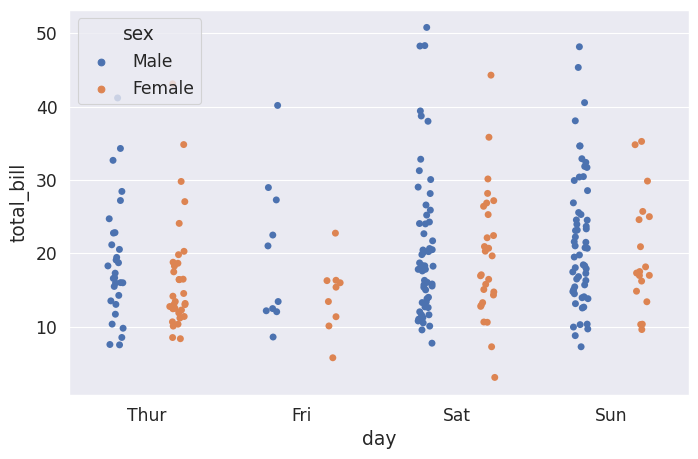
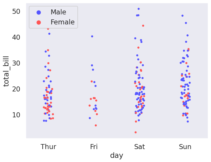
Strip Plot#
plt.figure(figsize=(8,5))

# The strip plot draws a scatter plot representing all data points where one
# variable is categorical. It is often used to show all observations with
# a box plot that represents the average distribution
# Jitter spreads data points out so that they aren't stacked on top of each other
# Hue breaks data into men and women
# Dodge separates the men and women data
sns.stripplot(x='day',y='total_bill',data=tips_df, jitter=True,
              hue='sex', dodge=True)
<AxesSubplot: xlabel='day', ylabel='total_bill'>
Swarm Plot#
# A swarm plot is like a strip plot, but points are adjusted so they don't overlap
# It looks like a combination of the violin and strip plots
# sns.swarmplot(x='day',y='total_bill',data=tips_df)

# You can stack a violin plot with a swarm
sns.violinplot(x='day',y='total_bill',data=tips_df)
sns.swarmplot(x='day',y='total_bill',data=tips_df, color='white')
<AxesSubplot: xlabel='day', ylabel='total_bill'>
Palettes#
plt.figure(figsize=(8,6))

sns.set_style('dark')

sns.set_context('talk')

# You can use Matplotlibs color maps for color styling
# https://matplotlib.org/3.3.1/tutorials/colors/colormaps.html
sns.stripplot(x='day',y='total_bill',data=tips_df, hue='sex',
             palette='seismic')

# Add the optional legend with a location number (best: 0,
# upper right: 1, upper left: 2, lower left: 3, lower right: 4,
# https://matplotlib.org/3.3.1/api/_as_gen/matplotlib.pyplot.legend.html)
# or supply a tuple of x & y from lower left
plt.legend(loc=0)
<matplotlib.legend.Legend at 0x7f25046c0850>
Matrix Plots#
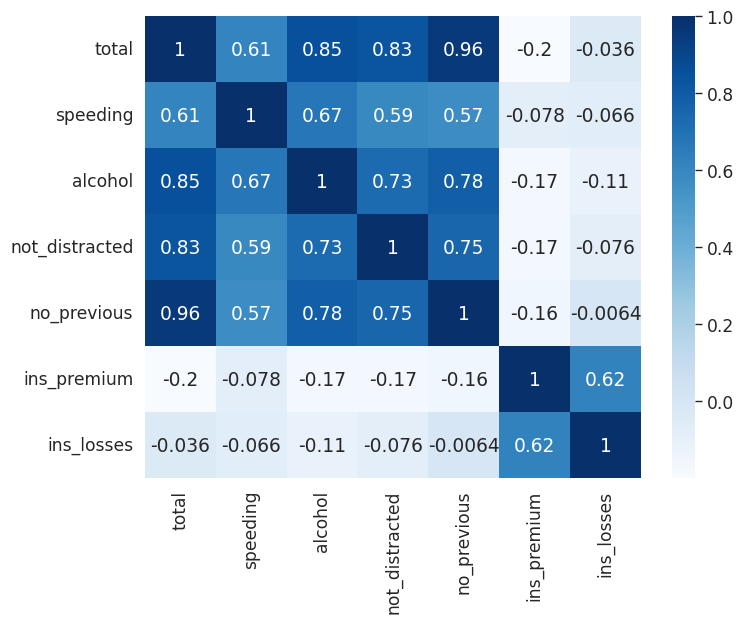
Heatmaps#
plt.figure(figsize=(8,6))
sns.set_context('paper', font_scale=1.4)
# To create a heatmap with data you must have data set up as a matrix where variables
# are on the columns and rows

# Correlation tells you how influential a variable is on the result
# So we see that n previous accident is heavily correlated with accidents, while the
# insurance premium is not
crash_mx = crash_df.corr()

# Create the heatmap, add annotations and a color map
sns.heatmap(crash_mx, annot=True, cmap='Blues')
/tmp/ipykernel_2180/3617987810.py:9: FutureWarning: The default value of numeric_only in DataFrame.corr is deprecated. In a future version, it will default to False. Select only valid columns or specify the value of numeric_only to silence this warning.
  crash_mx = crash_df.corr()
<AxesSubplot: >
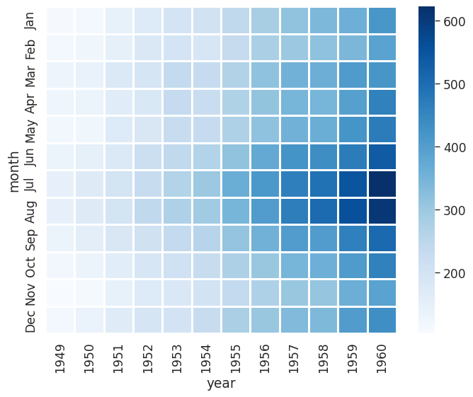
plt.figure(figsize=(8,6))
sns.set_context('paper', font_scale=1.4)

# We can create a matrix with an index of month, columns representing years
# and the number of passengers for each
# We see that flights have increased over time and that most people travel in
# July and August
flights = sns.load_dataset("flights")
flights = flights.pivot_table(index='month', columns='year', values='passengers')
# You can separate data with lines
sns.heatmap(flights, cmap='Blues', linecolor='white', linewidth=1)
<AxesSubplot: xlabel='year', ylabel='month'>
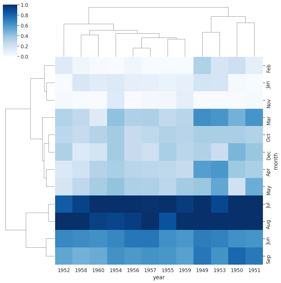
Cluster Map#
plt.figure(figsize=(8,6))
sns.set_context('paper', font_scale=1.4)

# A Cluster map is a hierarchically clustered heatmap
# The distance between points is calculated, the closest are joined, and this
# continues for the next closest (It compares columns / rows of the heatmap)
# This is data on iris flowers with data on petal lengths
iris = sns.load_dataset("iris")
# Return values for species
# species = iris.pop("species")
# sns.clustermap(iris)

# With our flights data we can see that years have been reoriented to place
# like data closer together
# You can see clusters of data for July & August for the years 59 & 60
# standard_scale normalizes the data to focus on the clustering
sns.clustermap(flights,cmap="Blues", standard_scale=1)
<seaborn.matrix.ClusterGrid at 0x7f250487de40>
<Figure size 800x600 with 0 Axes>
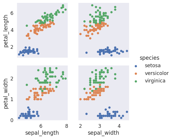
PairGrid#
plt.figure(figsize=(8,6))
sns.set_context('paper', font_scale=1.4)

# You can create a grid of different plots with complete control over what is displayed
# Create the empty grid system using the provided data
# Colorize based on species
# iris_g = sns.PairGrid(iris, hue="species")

# Put a scatter plot across the upper, lower and diagonal
# iris_g.map(plt.scatter)

# Put a histogram on the diagonal
# iris_g.map_diag(plt.hist)
# And a scatter plot every place else
# iris_g.map_offdiag(plt.scatter)

# Have different plots in upper, lower and diagonal
# iris_g.map_upper(plt.scatter)
# iris_g.map_lower(sns.kdeplot)

# You can define define variables for x & y for a custom grid
iris_g = sns.PairGrid(iris, hue="species",
                      x_vars=["sepal_length", "sepal_width"],
                      y_vars=["petal_length", "petal_width"])

iris_g.map(plt.scatter)

# Add a legend last
iris_g.add_legend()
<seaborn.axisgrid.PairGrid at 0x7f2504a60d00>
<Figure size 800x600 with 0 Axes>
Facet Grid#
# Can also print multiple plots in a grid in which you define columns & rows
# Get histogram for smokers and non with total bill for lunch & dinner
# tips_fg = sns.FacetGrid(tips_df, col='time', row='smoker')
# You can pass in attributes for the histogram
# tips_fg.map(plt.hist, "total_bill", bins=8)
# Create a scatter plot with data on total bill & tip (You need to parameters)
# tips_fg.map(plt.scatter, "total_bill", "tip")
# We can assign variables to different colors and increase size of grid
# Aspect is 1.3 x the size of height
# You can change the order of the columns
# Define the palette used
# tips_fg = sns.FacetGrid(tips_df, col='time', hue='smoker', height=4, aspect=1.3,
# col_order=['Dinner', 'Lunch'], palette='Set1')
# tips_fg.map(plt.scatter, "total_bill", "tip", edgecolor='w')
# # Define size, linewidth and assign a color of white to markers
# kws = dict(s=50, linewidth=.5, edgecolor="w")
# # Define that we want to assign different markers to smokers and non
# tips_fg = sns.FacetGrid(tips_df, col='sex', hue='smoker', height=4, aspect=1.3,
# hue_order=['Yes','No'],
# hue_kws=dict(marker=['^', 'v']))
# tips_fg.map(plt.scatter, "total_bill", "tip", **kws)
# tips_fg.add_legend()
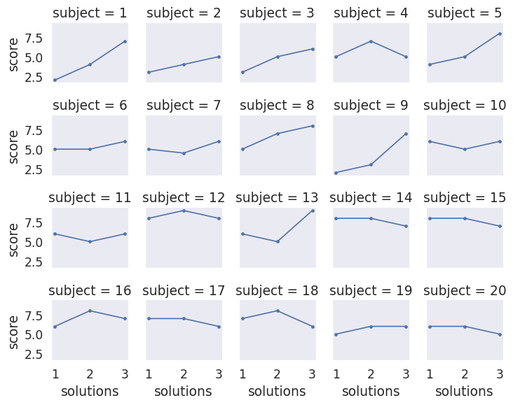
# This dataframe provides scores for different students based on the level
# of attention they could provide during testing
att_df = sns.load_dataset("attention")
# Put each person in their own plot with 5 per line and plot their scores
att_fg = sns.FacetGrid(att_df, col='subject', col_wrap=5, height=1.5)
att_fg.map(plt.plot, 'solutions', 'score', marker='.')
<seaborn.axisgrid.FacetGrid at 0x7f2504a626e0>
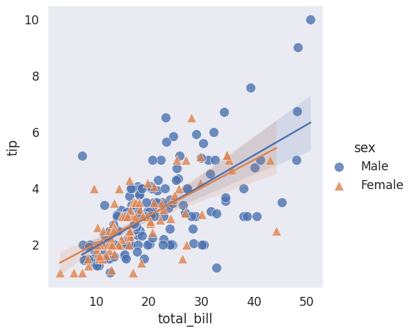
Regression Plots#
# lmplot combines regression plots with facet grid
tips_df = sns.load_dataset('tips')
tips_df.head()
| total_bill | tip | sex | smoker | day | time | size | |
|---|---|---|---|---|---|---|---|
| 0 | 16.99 | 1.01 | Female | No | Sun | Dinner | 2 |
| 1 | 10.34 | 1.66 | Male | No | Sun | Dinner | 3 |
| 2 | 21.01 | 3.50 | Male | No | Sun | Dinner | 3 |
| 3 | 23.68 | 3.31 | Male | No | Sun | Dinner | 2 |
| 4 | 24.59 | 3.61 | Female | No | Sun | Dinner | 4 |
plt.figure(figsize=(8,6))
sns.set_context('paper', font_scale=1.4)

plt.figure(figsize=(8,6))

# We can plot a regression plot studying whether total bill effects the tip
# hue is used to show separation based off of categorical data
# We see that males tend to tip slightly more
# Define different markers for men and women
# You can effect the scatter plot by passing in a dictionary for styling of markers
sns.lmplot(x='total_bill', y='tip', hue='sex', data=tips_df, markers=['o', '^'],
          scatter_kws={'s': 100, 'linewidth': 0.5, 'edgecolor': 'w'})
<seaborn.axisgrid.FacetGrid at 0x7f24feba5c90>
<Figure size 800x600 with 0 Axes>
<Figure size 800x600 with 0 Axes>
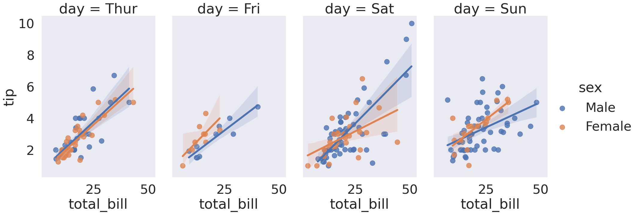
# You can separate the data into separate columns for day data
# sns.lmplot(x='total_bill', y='tip', col='sex', row='time', data=tips_df)
tips_df.head()

# Makes the fonts more readable
sns.set_context('poster', font_scale=1.4)

sns.lmplot(x='total_bill', y='tip', data=tips_df, col='day', hue='sex',
          height=8, aspect=0.6)
<seaborn.axisgrid.FacetGrid at 0x7f24fea0fbe0>