Task 4: COVID-19 EDA II#
For this task, you’ll do some further analysis on the .csv file you made from Task 3.
Remember to run the following commands below to import all the necessary packages to run this Task.
import pandas as pd
import numpy as np
import matplotlib
4.1: Importing filtered data#
First, import the datafiltered.csv file back into a dataframe and call the variable df.
# Your solution here
Then, remove the additional index column that was made when you exported the file.
Sample output#
date |
new_cases |
new_deaths |
new_tests |
incident_rate |
|
|---|---|---|---|---|---|
0 |
2020-04-20 |
3047 |
433 |
7841 |
0.388598 |
1 |
2020-04-21 |
2256 |
454 |
28095 |
0.080299 |
2 |
2020-04-22 |
2729 |
534 |
44248 |
0.0616751 |
3 |
2020-04-23 |
3370 |
437 |
37083 |
0.0908772 |
4 |
2020-04-24 |
2646 |
464 |
95273 |
0.0277728 |
5 |
2020-04-25 |
3021 |
420 |
38676 |
0.0781105 |
6 |
2020-04-26 |
2357 |
415 |
24113 |
0.0977481 |
7 |
2020-04-27 |
2324 |
260 |
26678 |
0.087113 |
8 |
2020-04-28 |
1739 |
333 |
37554 |
0.0463067 |
9 |
2020-04-29 |
2091 |
382 |
38589 |
0.0541864 |
# Your solution here
Finally, print out 10 random rows in df to ensure your data has been imported correctly. (Hint: There is a pandas function that does this)
# Your solution here
4.2: Grouping data#
If we want to know the average number of rates by the months in the year, we can use a groupby object to better understand how seasonal changes can affect COVID-19.
For this task, you should group the dataframe by month, then select the new_cases, new_deaths column, and then calculate the average value by month.
Make sure the output is displayed without using the print() function, remember that the last cell in a jupyter notebook will always be displayed.
Sample Output#
date |
new_cases |
new_deaths |
|---|---|---|
4 |
2515.09 |
405 |
5 |
937.839 |
182.516 |
6 |
259.067 |
46.8 |
7 |
216.839 |
12.5161 |
8 |
679.355 |
11.129 |
9 |
996 |
6 |
For this sub-task, a research question that this table would’ve answered might look something like this:
“What is the mean number of new cases and deaths by month?”
# Your solution here
4.3: Cumulative Sums#
A cumulative sum is a partial sum of each row, growing in total as you go down the list.
Using the original dataframe, df, create two new columns titled cumulative_new_cases and cumulative_new_tests.
Make sure the output is displayed without using the print() function, remember that the last cell in a jupyter notebook will always be displayed.
Sample Output#
date |
new_cases |
new_deaths |
new_tests |
incident_rate |
cumulative_new_cases |
cumulative_new_tests |
|
|---|---|---|---|---|---|---|---|
0 |
2020-04-20 |
3047 |
433 |
7841 |
0.388598 |
3047 |
7841 |
1 |
2020-04-21 |
2256 |
454 |
28095 |
0.080299 |
5303 |
35936 |
2 |
2020-04-22 |
2729 |
534 |
44248 |
0.0616751 |
8032 |
80184 |
3 |
2020-04-23 |
3370 |
437 |
37083 |
0.0908772 |
11402 |
117267 |
4 |
2020-04-24 |
2646 |
464 |
95273 |
0.0277728 |
14048 |
212540 |
5 |
2020-04-25 |
3021 |
420 |
38676 |
0.0781105 |
17069 |
251216 |
6 |
2020-04-26 |
2357 |
415 |
24113 |
0.0977481 |
19426 |
275329 |
7 |
2020-04-27 |
2324 |
260 |
26678 |
0.087113 |
21750 |
302007 |
8 |
2020-04-28 |
1739 |
333 |
37554 |
0.0463067 |
23489 |
339561 |
9 |
2020-04-29 |
2091 |
382 |
38589 |
0.0541864 |
25580 |
378150 |
For this sub-task, a research question that this table would’ve answered might look something like this:
“What is the sum as time progresses for the number of new cases and new tests?”
# Your solution here
4.4: Visualising Data#
4.4.1: Set the Seaborn figure theme and scale up the text in the figures#
There are five preset Seaborn styles (or themes): darkgrid, whitegrid, dark, white, and ticks.
They are each suited to different applications and personal preferences.
You can see what they look like here.
Hint: You will need to use the font_scale property of the set_theme() function in Seaborn.
Once you’ve done that, create the same plot as in 1.1 and confirm that it looks bigger. Once you are able to confirm this, you will see all subsequent plots in this Jupyter Notebook using the same theme.
Remember to copy this code above to your other Jupyter Notebooks as well!!
# Your solution here
4.4.2: Visualize the COVID-19 dataset#
You’ve previously done work on the COVID-19 dataset, filtering through and analysing the data.
However, data is best represented visually (usually), so we should take our data and visually represent some points.
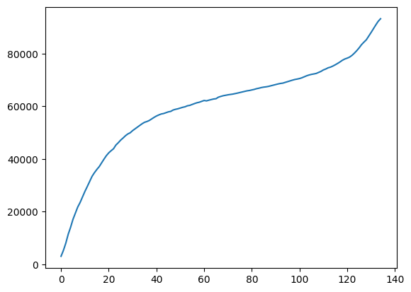
You’re task is to create a simple plot of the cumulative_new_cases column.
Sample Output#
Note: We have left off the themes, axis-labels, axis titles, and plot titles so you can spend some time interpreting what you’re plotting. Make sure your plot has all the components of what makes an effective plot!

# Your solution here

