Task 2: Using Seaborn for Pokemon Visualizations#
We will learn more about seaborn later in the course, but for now we will show you some very basic functionality about creating some plots.
import pandas as pd
import numpy as np
import matplotlib.pyplot as plt
import seaborn as sns
2.1 Load your saved dataset from Task 1#
Use the read_csv() function from the pandas package to load the dataset you saved in Task 1, so we can use it in this notebook.
# Your solution here
df = pd.read_csv('https://github.com/firasm/bits/raw/master/pokemon.csv')
df
| # | Name | Type 1 | Type 2 | Total | HP | Attack | Defense | Sp. Atk | Sp. Def | Speed | Generation | Legendary | |
|---|---|---|---|---|---|---|---|---|---|---|---|---|---|
| 0 | 1 | Bulbasaur | Grass | Poison | 318 | 45.0 | 49.0 | 49.0 | 65.0 | 65.0 | 45 | 1 | False |
| 1 | 2 | Ivysaur | Grass | Poison | 405 | 60.0 | 62.0 | 63.0 | 80.0 | 80.0 | 60 | 1 | False |
| 2 | 3 | Venusaur | Grass | Poison | 525 | 80.0 | 82.0 | 83.0 | 100.0 | 100.0 | 80 | 1 | False |
| 3 | 3 | VenusaurMega Venusaur | Grass | Poison | 625 | 80.0 | 100.0 | 123.0 | 122.0 | 120.0 | 80 | 1 | False |
| 4 | 4 | Charmander | Fire | NaN | 309 | 39.0 | 52.0 | 43.0 | 60.0 | 50.0 | 65 | 1 | False |
| ... | ... | ... | ... | ... | ... | ... | ... | ... | ... | ... | ... | ... | ... |
| 795 | 719 | Diancie | Rock | Fairy | 600 | 50.0 | 100.0 | 150.0 | 100.0 | 150.0 | 50 | 6 | True |
| 796 | 719 | DiancieMega Diancie | Rock | Fairy | 700 | 50.0 | 160.0 | 110.0 | 160.0 | 110.0 | 110 | 6 | True |
| 797 | 720 | HoopaHoopa Confined | Psychic | Ghost | 600 | 80.0 | 110.0 | 60.0 | 150.0 | 130.0 | 70 | 6 | True |
| 798 | 720 | HoopaHoopa Unbound | Psychic | Dark | 680 | 80.0 | 160.0 | 60.0 | 170.0 | 130.0 | 80 | 6 | True |
| 799 | 721 | Volcanion | Fire | Water | 600 | 80.0 | 110.0 | 120.0 | 130.0 | 90.0 | 70 | 6 | True |
800 rows × 13 columns
2.2: Plot Pokemon Attack vs. Speed using seaborn#
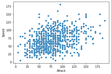
For this plot, you will be creating a scatter plot which just plots two quantitative axes (Attack and Speed).
Note: Most seaborn plotting functions return an “Axis object” as the returned value, and it’s convention to store that as a variable.
So you would do something like:
ax_pokemon_plot1 = sns.scatterplot(...)
Sample Output#

As you can see, this plot doesn’t look too good right now, it’s missing a title, the font sizes are very small, there are a lot of distracting visual elements (borders, borders around the points), as well as some “overplotting” (points on top of each other). In the next few questions, we will fix most of these issues and leave “overplotting” to later on in the course.
# Your Solution Here
2.2: Set the Seaborn figure theme and scale up the text in the figures#
There are five preset Seaborn styles (or themes): darkgrid, whitegrid, dark, white, and ticks.
They are each suited to different applications and personal preferences.
You can see what they look like here.
Hint: You will need to use the font_scale property of the set_theme() function in Seaborn.
Once you’ve done that, create the same plot as in 1.1 and confirm that it looks bigger. Once you are able to confirm this, you will see all subsequent plots in this Jupyter Notebook using the same theme.
Remember to copy this code above to your other Jupyter Notebooks as well!!
Sample Output#
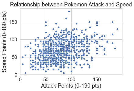
Your plot should now look something like this:

Note: Most seaborn plotting functions return an “Axis object” as the returned value, and it’s convention to store that as a variable.
Remember that you’ve already stored the Axis object from Task 1 as a variable, and to re-show the figure with the new theme, you just have to use ax_pokemon_plot1.figure
# Your solution here for setting the figure theme and scaling up the text

# Reshow the figure
ax_pokemon_plot1.figure
A bit of an improvement for sure!
# Your solution here
2.3 Update axis labels and figure titles#
A plot isn’t complete until it clearly communicates its intent and purpose, so we need to add figure titles, clearer axis labels. Also, we want to make the bottom left corner of the plot exactly at the coordinate (0,0).
For the plot you created above, update the following using ax_pokemon_plot1.set(...) :
Figure Title: “Relationship between Pokemon Attack and Speed”
x-axis label: “Pokemon Attack Points (0-190 pts)”
y-axis label: “Pokemon Speed Points (0-180 pts)”
Set x- and y- axis limits to 0 (minimum) and None (maximum; None will auto-set it)
Sample Plot#

We’re getting there!
# Your Solution Here
2.4. Research question#
2.4.1 Come up with at least two research questions about your dataset that will require data visualizations to help answer.#
Recall that for this purpose, you should only aim for “Descriptive” or “Exploratory” research questions.
Hint1: You are welcome to calculate any columns that you think might be useful to answer the question (or re-add dropped columns like ‘Generation’, ‘Sp. Atk’, ‘Sp. Def’.*
Hint2: Try not to overthink this; this is a toy dataset about Pokémon, you’re not going to solve climate change or cure world hunger. Focus your research questions on the various Pokémon attributes, and the types.
# Your solution here:#
1. Sample Research Question: Which Pokemon Types are the best, as determined by the Weighted Score?
2. Your RQ 1:
3. Your RQ 2:
# Your Solution Here
2.5 Answer your research questions with visualizations#
Remember to refer to the seaborn gallery for ideas on different visualizations.
# Your solution here to RQ1
# Your solution here to RQ2

