DATA 301 Lab 7 - Visualization with Tableau
Accept lab 7 here.
Instructions
For this lab, the instructions are in this README file. There is an accompanying video as part of the Week 10 Videos
This lab uses Tableau to visualize, analyze, and explore data sets. This lab should be done individually.
Objectives
Explore the capabilities of Tableau for importing, formatting, and visualizing data sets.
Visualize data from an Excel spreadsheet including using bar charts, line charts, maps, and trend lines.
Apply filtering, sorting, and aggregation in visualizations.
Create a dashboard consisting of multiple related visualizations.
Installing Tableau
Download the latest version of Tableau Desktop (you do not need Tableau Prep Builder).
Click on the link above and select “Download Tableau Desktop”. On the form, enter your school email address for Business E-mail and enter the name of your school for Organization.
Activate with your product key:
TCHO-57EF-BE10-52AA-AE8FIf you already have a copy of Tableau Desktop installed: update your license in the application: Help menu → Manage Product Keys
A. Load in the street_trees Data.
4 marks.
A1. Load the data (2 marks)
We have provided you with data obtained from The City of Vancouver’s Open Data Portal with minimal data wrangling done by the R package DatateachR.
Instructions
On the left-hand side in the blue bar, you’ll see a “Connect” heading. This is where you can connect Tableau to your data.
Since we are using a
.csvfile we are going to click on “More…” under the “To a File” subheading.
💡You can connect to many different things such as Microsoft SQL, PostgresSQL, Google Sheets, MongoDB BI Connector, etc. This is all accessible in “More…” under the sub-heading “To a Server”.Locate the data and click “Open”. This should connect your data and you should see a table. (You may need to click the “Update Now” button at the bottom)
You can choose to rename your data source by clicking the title at the top.
To start creating plots you can click “Sheet 1” at the bottom left of the window.
A2. Set the data types for the columns (2 marks)
Tableau automatically assigns variable types to your columns, however, sometimes it doesn’t guess correctly.
Instructions
We need to change the last 3 columns in our data
date_planted,latitudeandlongitude.Scroll to the right and click on the icon (ABC) to the left of
date_plantedand convert it to Date.Next, convert
longitudeandLatitudeto a Number (decimal) and the under the Geographic Role we can assign it to Longitude and Latitude respectively.💡If we do not convert these columns to decimals first, Tableau will give you the Latitude and Longitude options under Geographic Role
B. Bar Charts in Tableau.
4 marks.
B1. Tree count (2 marks)
Make a new worksheet called B1 by going to the menu bar under “Worksheet” and clicking “New Worksheet” (Or Command+T on a Mac, Ctrl+T on Windows).
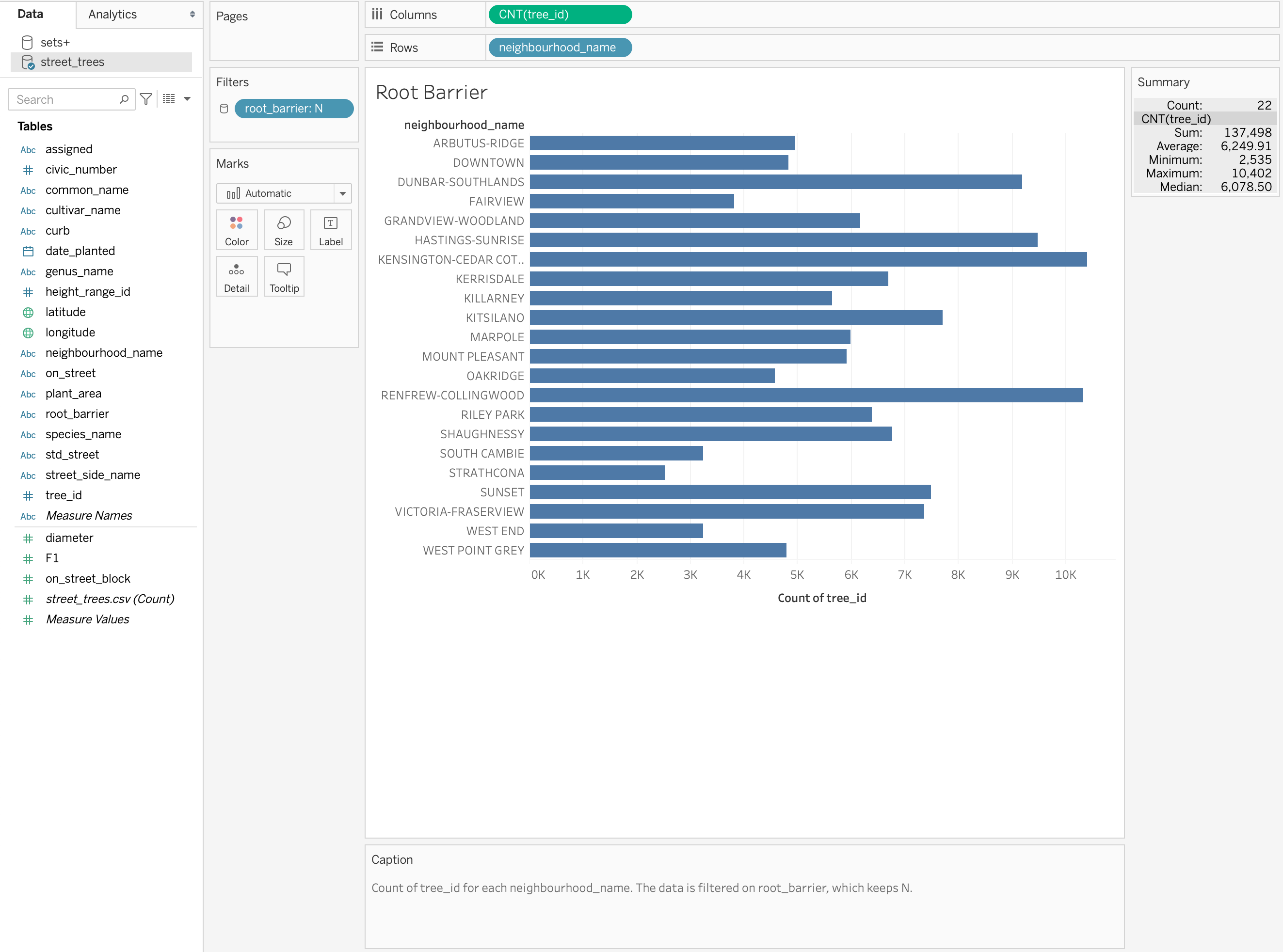
We are going to make a bar chart for the number of trees in each neighbourhood.
Output
Instructions
Since we are interested in the neighbourhood, we are going to drag from the left-hand side under the heading “Tables” the column named
neighbourhood_nameto the “Column” toolbar.We are interested in the count of the trees in each neighbourhood, so I like to use the index to count the rows but you can use multiple different columns here. Drag the
tree_idto the “Rows” toolbar.We need to convert this variable to a “Measure” specifically a “Count”. We can do this by right-clicking on it.
Voila! A bar chart!
Let’s change the colour. Go to the mark card and select a new colour.
Let’ edit our y-axis label. Right-click on the axis and click “Edit Axis…” Under “Axis”, you can edit your axis “Title”.
You can edit the title in two ways by editing the sheet name or by editing the title. I prefer to edit the sheet name by double-clicking the sheet at the bottom.
You can sort the bars by clicking the icon beside the axis title.
Let’s convert it to a verticle bar chart. On the toolbar right above “Columns” you’ll see a “Swap rows and columns” icon. This transposes your graph so the x and y-axes are flipped (remember keep your text description values on the y-axis so you don’t have to turn your head to read them.
B2. Tree diameter (2 marks)
Create a new sheet called B2 and plot the average diameter of the tree trunks of each genus_name type.
This is very similar to how you would make a bar plot with one minor different we no longer are using a “Count” “Measure” but instead perhaps “Average”, “Median”, “Max” or “Min”.
Output
Instructions
Drag from the left-hand side under the heading “Tables” the column named
genus_typeto the “Column” toolbar.We want the mean diameter for each genus so we can drag
diameterto the “Rows” toolbar.This is where things differ. We right click the
diameterand transform the “Measure” to “Average”.Instead of using a bar chart, try a dot plot would be more ideal. We can convert it by clicking the dropdown menu under the “Marks” card. Selecting “Circle” or “Shape” will instantly convert it.
💡You can add your own shape icons by adding a folder to your “My Tableau Repository” folder under “Shapes”
C. Time Series.
4 marks.
C1. Trees planted by Year (2 marks)
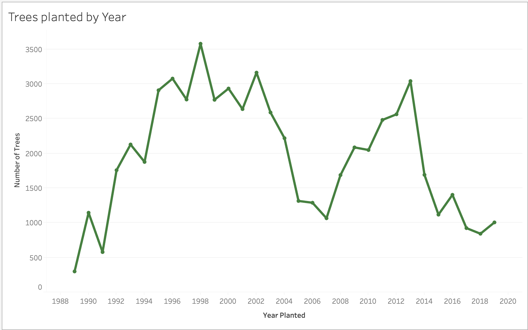
Create a new sheet called C1 and plot the number of trees planted and the date they were planted so our two columns of interest are date_plated and tree_id.
Output
Instructions
Drag the
date_plantedvariable to the “Columns” toolbar and again thetree_idto “Rows”. We are again interested in the amount of trees planted at selected dates so once again we want to transform this to a “Count” type “Measure”.Since `date_planted’ is a continuous variable, it’s a good idea to right-click and transform this into a Continuous Dimension.
This automatically generates the number of trees planted at each year (but there are null values!)
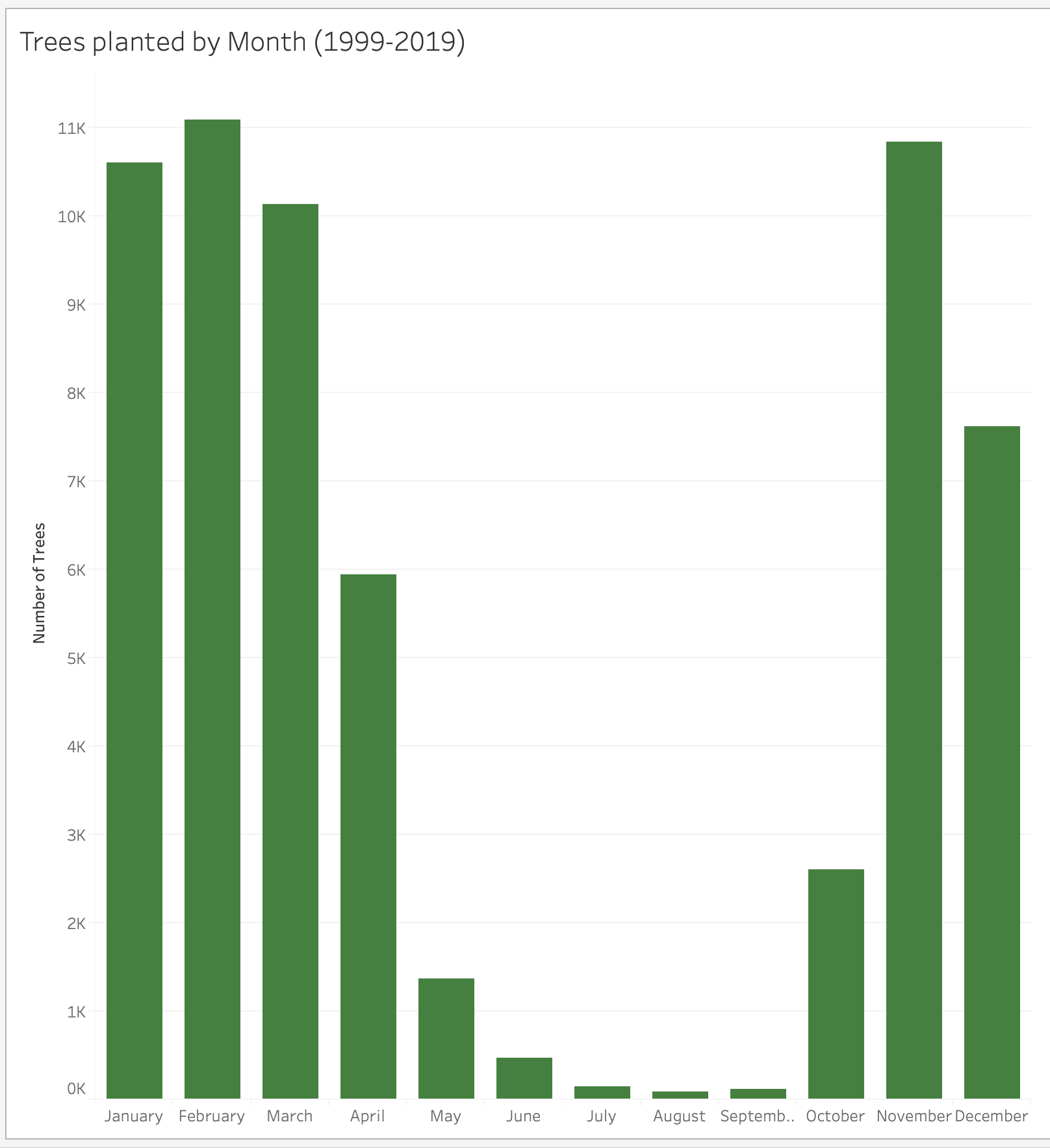
We can change this to:
month - discrete (Top month choice when right-clicking) which aggregates months together for all years
month - continuous (Bottom month choice when right-clicking) which will make a sequential plot.
Combining scatterplot onto our line graph by adding an identical
tree_idto rows and converting it to a counting measurement again. At first, we should get 2 graphs on top of each other. We can right-click one of them and select “Dual Axis”. This will superimpose one on another with a left and a right axis title. We can hide the one on the right by right-clicking the axis and unticking the “Show Header” option.To change the colour of the line and the points, we need to make sure we change the colour of both measures by selecting the “All” tab under the “Marks” card on the right.
Don’t forget to give it a title and edit the y-axis label as we did earlier.
D. Maps (Choropleths)
2 marks.
This, and creating dashboards, is where Tableau really shines!
D1. Map of the trees planted (2 marks)
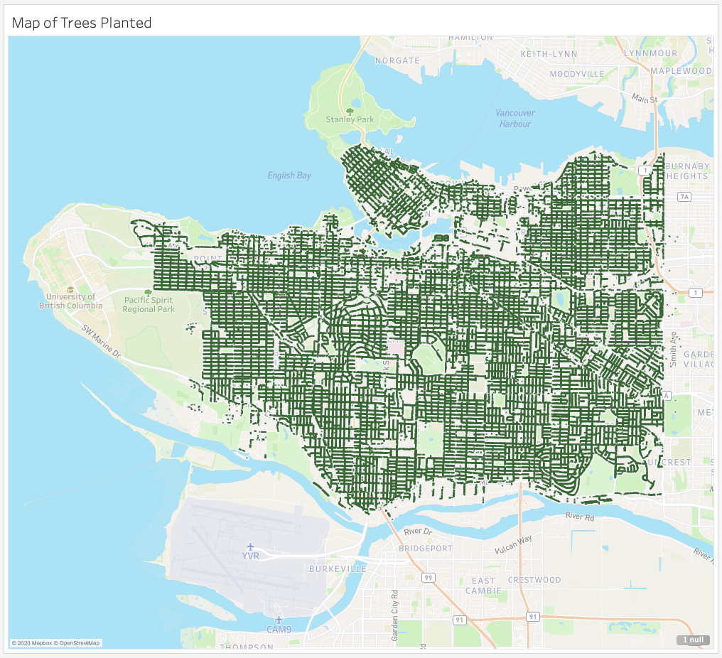
Plot the location of the planted trees on a map of Vancouver.
Output
Instructions
Drag
Longitudeto the “Columns” toolbar.Drag
Latitudeto the “Rows” toolbar.You have essentially made your map but let’s tidy it up.
Decrease the size of your markers by clicking the “Size” icon under the “Marks” card.
Click “Map” on the top toolbar and select “Map Layers…”. This gives you the ability to customize the appearance of your map. You may want to:
Change the map style
Add opacity to the map with “Washout”
Add different Map Layers
Add a title as before and you’ve got a functioning map plot in < 5 mins.
E. Putting it all Together in a Dashboard
7 marks.
You can take an arbitrary number of plots in sheets and lay them out in a “Dashboard”. This part of the lab guides you on how to do this.
E1. Making a Dashboard (5 marks)
Create a new dashboard by clicking “Dashboard” in the top menu bar and selecting “New Dashboard”
Before you do anything else, under the “Size” heading, click the triangle beside “Desktop Browser (1000x800)”. Change “Fixed Size” to “Automatic”. This will now make sure your dashboard adjusts to all monitor sizes.
Let drag our sheets in using Tiled objects. Under “Sheets” on the left-hand side, drag and drop the sheets you want to include in your dashboard.
Sample Output
Here is a sample dashboard, you do not have to create one exactly like this one, but you should include at least 2 filters, and at least 4 plot elements.
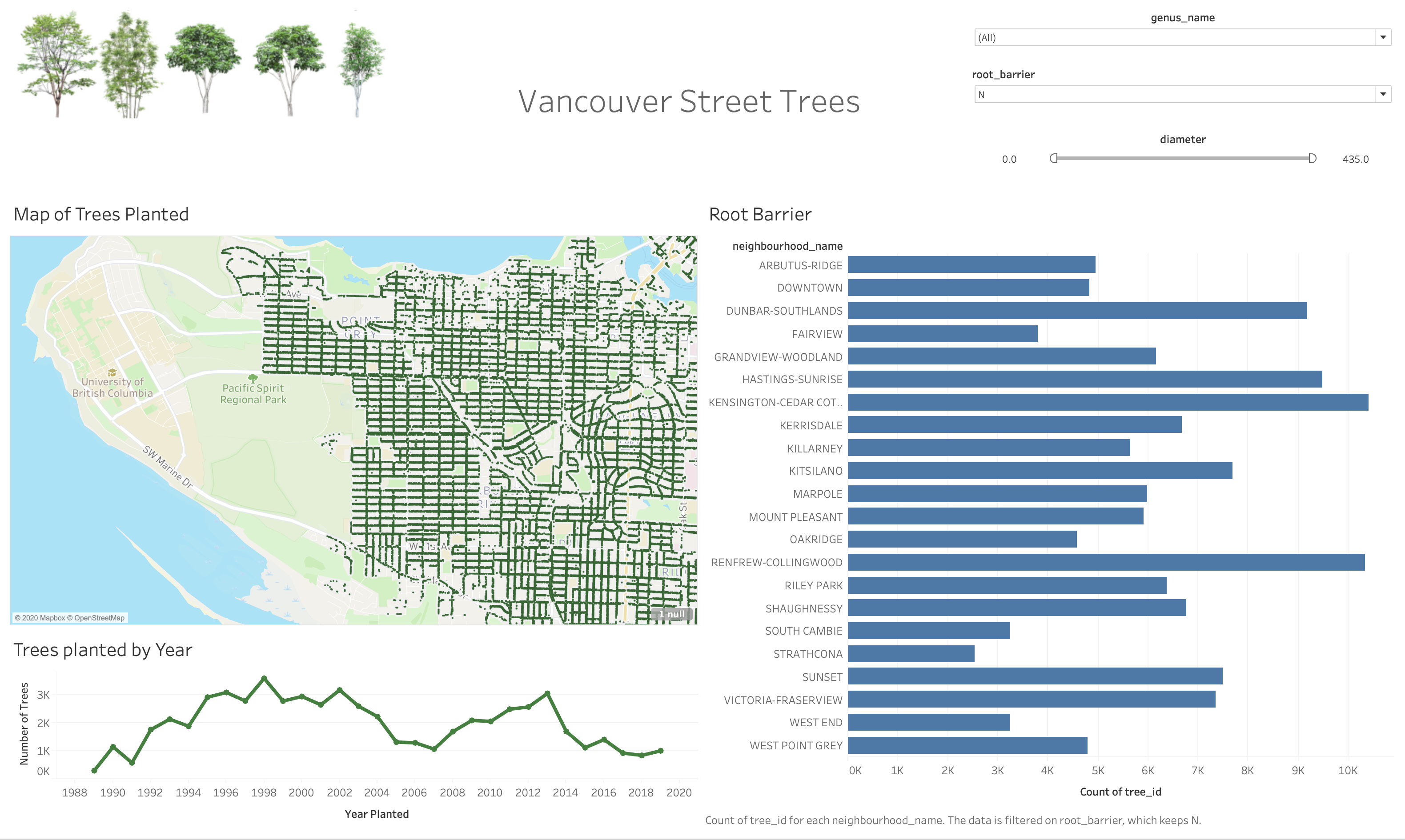
Filters (2 marks)
Decide which filters you want for each plot.
Go to the sheet my navigating on the bottom and selected the worksheet of interest.
Under “Tables” Drag the column you wish to filter, in our case
Diameter,root_barrierandneighbourhood_nameto the “Filters” card above “Marks”.For
diameter, since it is a continuous variable we want to select “All Values”. We can decide on what kind of filtering we want but we are sticking to a “range”.For
root_barrierwe want to select all values and then “OK”.The same applies for
neighbourhood_name.
Repeat this step for each of your worksheets. (OR wait and follow the next section)
To obtain filters, on the side of the dashboard you will see a ▼ icon. Click this and under “Filter” Select one of the column names.
We can edit the filter style by clicking the “More Options” ▼ icon and changing the style.
If it’s filtering categorical data there are options like “Single value (list)”, “Single value (dropdown)”, “Single value (slider)”, “Multiple value (dropdown)”, etc.
You can “Customize” The filter styles to include certain features as well.
One Filter For Multiple Graphs
If you want to use a single filter for multiple plots, you can do so using the “Apply to Worksheet” option.
This gives you the ability to select which sheet to also be filtered on this column or you can apply to “All Using This Data Source”.
Using a Graph as a Filter
If you want to use a highlight something on a plot and have it act as a filter on other sheets in the dashboard, this can be done with a single mouse click.
Simply find the funnel icon on the side. When you hover over it, it should say “Use Sheet as Filter”.
Submission
Include the Tableau Workbook file (.twb), and a screenshot of your final dashboard called “final_dashboard.png” in this GitHub repository and you’re done!
Attribution
This seminar was conducted in collaboration with Hayley Boyce. Hayley created the first draft of this workshop, and it was adapted in the summer of 2020 for DATA 301 and DATA 532.