Lecture 7
Contents
Lecture 7#
Trendlines, confidence intervals, and composite figures#
Lecture learning goals#
By the end of the lecture you will be able to:
Visualize pair-wise differences using a slope plot.
Visualize trends using regression and loess lines.
Create and understand how to interpret confidence intervals and confidence bands.
Telling a story with data (reading only)
Layout plots in panels of a figure grid.
Save figures outside the notebook.
Understand figure formats in the notebook.
Retrieve info on further topics online.
Readings#
This lecture’s readings are both from Fundamentals of Data Visualization.
Section 29 on how to tell a story with data. Telling a story with figures/data is a crucial skills to have and it will be part of this week’s lab. The only reason I am not covering this in lecture is because I think this section already says it pretty much perfectly and I don’t have much to add.
# Run this cell to ensure that altair plots show up in the exported HTML
# and that the R cell magic works
import altair as alt
import pandas as pd

# Save a vega-lite spec and a PNG blob for each plot in the notebook
alt.renderers.enable('mimetype')
# Handle large data sets without embedding them in the notebook
alt.data_transformers.enable('data_server')

# Load the R cell magic
%load_ext rpy2.ipython
Read in data#
Let’s start by looking at your results from the world health quiz we did in lab 1! Below, I read in the data and assign a label for whether each student had a positive or negative outlook of their own results compared to their estimation of the class average.
%%R
options(tidyverse.quiet = TRUE)
library(tidyverse)

theme_set(theme_light(base_size = 18))

scores_raw <- read_csv('data/students-gapminder.csv')
colnames(scores_raw) <- c('time', 'student_score', 'estimated_score')
scores <- scores_raw %>%
    mutate(diff = student_score - estimated_score,
           estimation = case_when(
               diff == 0 ~ 'neutral',
               diff < 0 ~ 'negative',
               diff > 0 ~ 'positive')) %>%
    pivot_longer(!c(time, estimation, diff)) %>%
    arrange(desc(diff))
scores
R[write to console]: Error in (function (filename = "Rplot%03d.png", width = 480, height = 480,  :
  Graphics API version mismatch
---------------------------------------------------------------------------
RRuntimeError                             Traceback (most recent call last)
Input In [2], in <cell line: 1>()
----> 1 get_ipython().run_cell_magic('R', '', "options(tidyverse.quiet = TRUE) \nlibrary(tidyverse)\n\ntheme_set(theme_light(base_size = 18))\n\nscores_raw <- read_csv('data/students-gapminder.csv')\ncolnames(scores_raw) <- c('time', 'student_score', 'estimated_score')\nscores <- scores_raw %>%\n    mutate(diff = student_score - estimated_score,\n           estimation = case_when(\n               diff == 0 ~ 'neutral',\n               diff < 0 ~ 'negative',\n               diff > 0 ~ 'positive')) %>%\n    pivot_longer(!c(time, estimation, diff)) %>%\n    arrange(desc(diff))\nscores\n")

File /opt/hostedtoolcache/Python/3.9.13/x64/lib/python3.9/site-packages/IPython/core/interactiveshell.py:2358, in InteractiveShell.run_cell_magic(self, magic_name, line, cell)
   2356 with self.builtin_trap:
   2357     args = (magic_arg_s, cell)
-> 2358     result = fn(*args, **kwargs)
   2359 return result

File /opt/hostedtoolcache/Python/3.9.13/x64/lib/python3.9/site-packages/rpy2/ipython/rmagic.py:765, in RMagics.R(self, line, cell, local_ns)
    762 else:
    763     cell_display = CELL_DISPLAY_DEFAULT
--> 765 tmpd = self.setup_graphics(args)
    767 text_output = ''
    768 try:

File /opt/hostedtoolcache/Python/3.9.13/x64/lib/python3.9/site-packages/rpy2/ipython/rmagic.py:461, in RMagics.setup_graphics(self, args)
    457 tmpd_fix_slashes = tmpd.replace('\\', '/')
    459 if self.device == 'png':
    460     # Note: that %% is to pass into R for interpolation there
--> 461     grdevices.png("%s/Rplots%%03d.png" % tmpd_fix_slashes,
    462                   **argdict)
    463 elif self.device == 'svg':
    464     self.cairo.CairoSVG("%s/Rplot.svg" % tmpd_fix_slashes,
    465                         **argdict)

File /opt/hostedtoolcache/Python/3.9.13/x64/lib/python3.9/site-packages/rpy2/robjects/functions.py:203, in SignatureTranslatedFunction.__call__(self, *args, **kwargs)
    201         v = kwargs.pop(k)
    202         kwargs[r_k] = v
--> 203 return (super(SignatureTranslatedFunction, self)
    204         .__call__(*args, **kwargs))

File /opt/hostedtoolcache/Python/3.9.13/x64/lib/python3.9/site-packages/rpy2/robjects/functions.py:126, in Function.__call__(self, *args, **kwargs)
    124     else:
    125         new_kwargs[k] = cv.py2rpy(v)
--> 126 res = super(Function, self).__call__(*new_args, **new_kwargs)
    127 res = cv.rpy2py(res)
    128 return res

File /opt/hostedtoolcache/Python/3.9.13/x64/lib/python3.9/site-packages/rpy2/rinterface_lib/conversion.py:45, in _cdata_res_to_rinterface.<locals>._(*args, **kwargs)
     44 def _(*args, **kwargs):
---> 45     cdata = function(*args, **kwargs)
     46     # TODO: test cdata is of the expected CType
     47     return _cdata_to_rinterface(cdata)

File /opt/hostedtoolcache/Python/3.9.13/x64/lib/python3.9/site-packages/rpy2/rinterface.py:813, in SexpClosure.__call__(self, *args, **kwargs)
    806     res = rmemory.protect(
    807         openrlib.rlib.R_tryEval(
    808             call_r,
    809             call_context.__sexp__._cdata,
    810             error_occured)
    811     )
    812     if error_occured[0]:
--> 813         raise embedded.RRuntimeError(_rinterface._geterrmessage())
    814 return res

RRuntimeError: Error in (function (filename = "Rplot%03d.png", width = 480, height = 480,  :
  Graphics API version mismatch
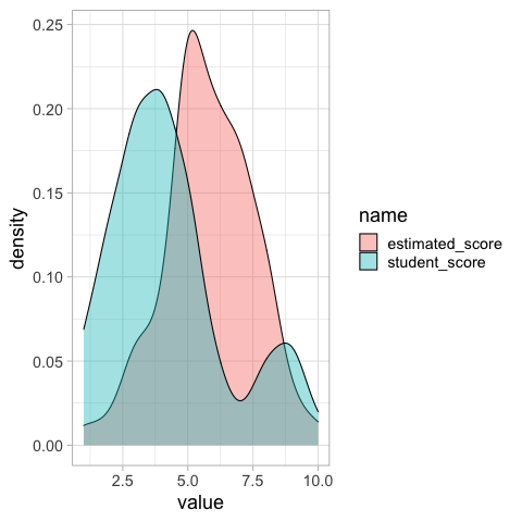
We could make a distribution plot, such as a KDE for the students score and estimated class score. From this plot we can see that on average students seemed to believe their classmates scored better, but we don’t know if this is because all students thought this, or some thought their classmates scored much better while others thought it was about the same.
%%R
ggplot(scores) +
    aes(x = value,
       fill = name) +
    geom_density(alpha=0.4)
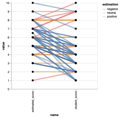
Paired comparisons with slope plots#
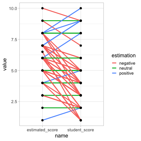
Drawing out each students score and estimated score, and then connecting them with a line allows us to easily see the trends in how many students thought their score was better or worse than the class.
%%R -o scores
ggplot(scores) +
    aes(x = name,
        y = value,
       group = time) +
    geom_line(aes(color = estimation), size = 1.5) +
    geom_point(size=3)

## This plot is *moderately* hard to read, I suggest faceting by estimation, or avoiding it altogether.
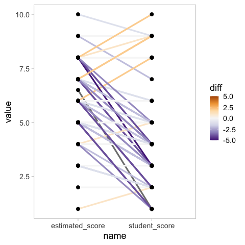
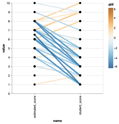
To make it easier to see how much better or worse each student score is compared to the class estimate, we can color the lines by the difference and set a diverging colormap.
%%R -o scores
ggplot(scores) +
    aes(x = name,
        y = value,
       group = time) +
    geom_line(aes(color = diff), size = 1.5) +
    geom_point(size=3) +
    scale_color_distiller(palette = 'PuOr', lim = c(-5, 5)) +
    theme(panel.grid.major = element_blank(),
          panel.grid.minor = element_blank())

## This plot is *really* hard to read! Change colour scheme, or just avoid altogether!
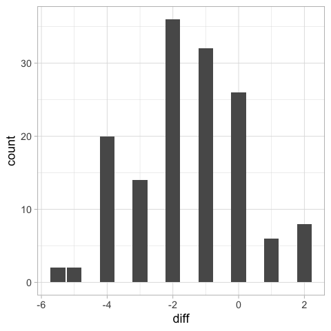
Another way we could have visualized these differences would have been as a bar plot of the differences, but we would not know the students’ score, just the difference.
%%R
ggplot(scores) +
    aes(x = diff) +
    geom_bar()
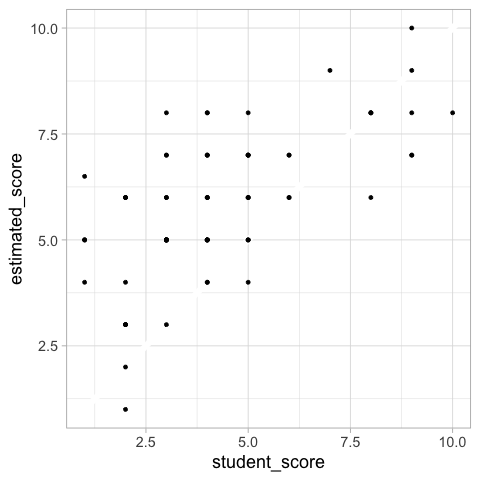
A scatter plot could also work for this comparison, ideally with a diagonal line at zero difference.
%%R
ggplot(scores_raw) +
    aes(x = student_score,
        y = estimated_score) +
    geom_abline(slope = 1, intercept = 0, color = 'white', size = 3) +
    geom_point()
Altair#
points = alt.Chart(scores).mark_circle(size=50, color='black', opacity=1).encode(
    alt.X('name'),
    alt.Y('value'),
    alt.Detail('time')).properties(width=300)
points.mark_line(size=4, opacity=0.5).encode(alt.Color('estimation')) + points
points = alt.Chart(scores).mark_circle(size=50, color='black', opacity=1).encode(
    alt.X('name'),
    alt.Y('value'),
    alt.Detail('time')).properties(width=300)
points.mark_line(size=4, opacity=0.8).encode(alt.Color('diff', scale=alt.Scale(scheme='blueorange', domain=(-6, 6)))) + points
Trendlines#
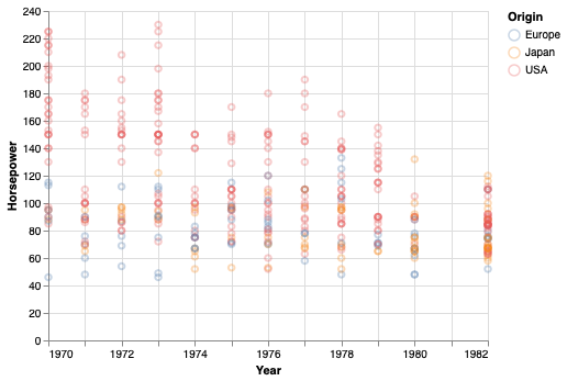
Trendlines (also sometimes called “lines of best fit”, or “fitted lines”) are good to highlight general trends in the data that can be hard to elucidate by looking at the raw data points. This can happen if there are many data points or many groups inside the data.
from vega_datasets import data

cars = data.cars()
cars
| Name | Miles_per_Gallon | Cylinders | Displacement | Horsepower | Weight_in_lbs | Acceleration | Year | Origin | |
|---|---|---|---|---|---|---|---|---|---|
| 0 | chevrolet chevelle malibu | 18.0 | 8 | 307.0 | 130.0 | 3504 | 12.0 | 1970-01-01 | USA |
| 1 | buick skylark 320 | 15.0 | 8 | 350.0 | 165.0 | 3693 | 11.5 | 1970-01-01 | USA |
| 2 | plymouth satellite | 18.0 | 8 | 318.0 | 150.0 | 3436 | 11.0 | 1970-01-01 | USA |
| 3 | amc rebel sst | 16.0 | 8 | 304.0 | 150.0 | 3433 | 12.0 | 1970-01-01 | USA |
| 4 | ford torino | 17.0 | 8 | 302.0 | 140.0 | 3449 | 10.5 | 1970-01-01 | USA |
| ... | ... | ... | ... | ... | ... | ... | ... | ... | ... |
| 401 | ford mustang gl | 27.0 | 4 | 140.0 | 86.0 | 2790 | 15.6 | 1982-01-01 | USA |
| 402 | vw pickup | 44.0 | 4 | 97.0 | 52.0 | 2130 | 24.6 | 1982-01-01 | Europe |
| 403 | dodge rampage | 32.0 | 4 | 135.0 | 84.0 | 2295 | 11.6 | 1982-01-01 | USA |
| 404 | ford ranger | 28.0 | 4 | 120.0 | 79.0 | 2625 | 18.6 | 1982-01-01 | USA |
| 405 | chevy s-10 | 31.0 | 4 | 119.0 | 82.0 | 2720 | 19.4 | 1982-01-01 | USA |
406 rows × 9 columns
points = alt.Chart(cars).mark_point(opacity=0.3).encode(
    alt.X('Year'),
    alt.Y('Horsepower'),
    alt.Color('Origin'))
points
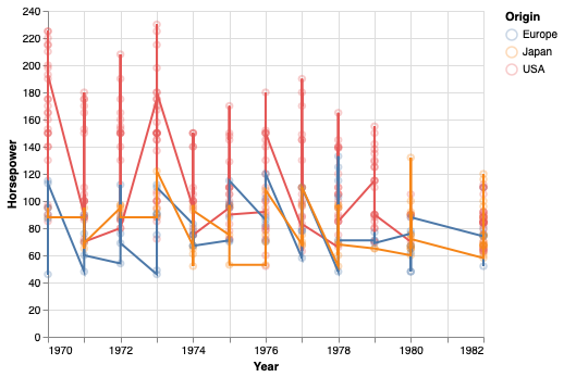
A not so effective way to visualize the trend in this data is to connect all data points with a line.
points + points.mark_line()
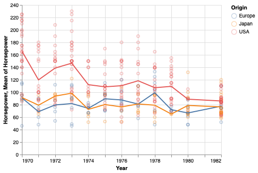
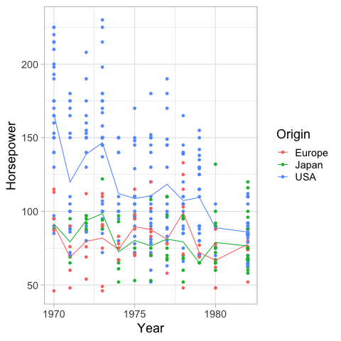
A simple way is to use the mean y-value at each x. This works OK in hour case because each year has several values, but in many cases with a continuous x-axis, you would need to bin it in order to avoid noise from outliers.
points + points.encode(y='mean(Horsepower)').mark_line()
An alternative to binning continuous data is to use a moving/rolling average,
that takes the mean of the last \(n\) observations.
In our example here,
a moving average becomes a bit complicated because there are so many y-values for the exact same x-value,
so we would need to calculate the average for each year first,
and then move/roll over that,
which can be done using the window_transform method in Altair.
A more common and simpler example can be viewed in the Altair docs.
# This will not be on a quiz, I added it for those who are interested.
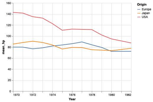
mean_per_year = cars.groupby(['Origin', 'Year'])['Horsepower'].mean().reset_index()
alt.Chart(mean_per_year).transform_window(
mean_hp='mean(Horsepower)',
frame=[-1, 1],
groupby=['Origin']).mark_line().encode(
x='Year',
y='mean_hp:Q',
color='Origin')
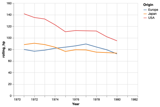
We can also use the rolling method in pandas for this calculation,
but it handles the edges a bit differently.
# This will not be on a quiz, I added it for those who are interested.
mean_per_year = cars.groupby(['Origin', 'Year'])['Horsepower'].mean().reset_index()
mean_per_year['rolling_hp'] = mean_per_year.groupby('Origin')['Horsepower'].rolling(3, center=True).mean().to_numpy()
alt.Chart(mean_per_year).mark_line().encode(
    x='Year',
    y='rolling_hp',
    color='Origin')
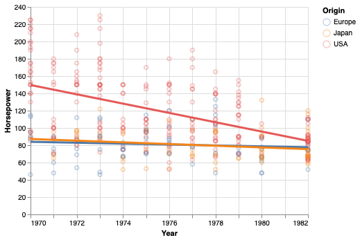
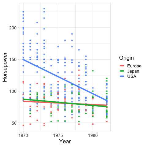
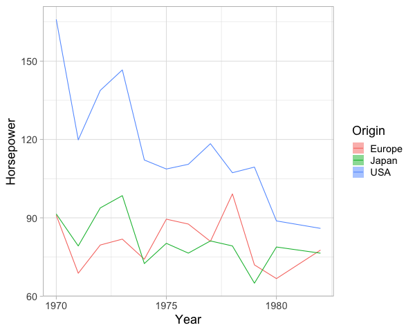
Another way of showing a trend in the data is via regression. You will learn more about this later in the program, but in brief you are fitting a straight line through the data, by choosing the line that minimizes a certain cost function (or penalty), commonly the sum squared deviations of the data to the line (least squares).
points +  points.transform_regression(
    'Year', 'Horsepower', groupby=['Origin']).mark_line(size=3)
You are not limited to fitting linear lines, but can try fits that are quadratic, polynomial, etc.
points +  points.transform_regression(
    'Year', 'Horsepower', groupby=['Origin'], method='poly').mark_line(size=3)

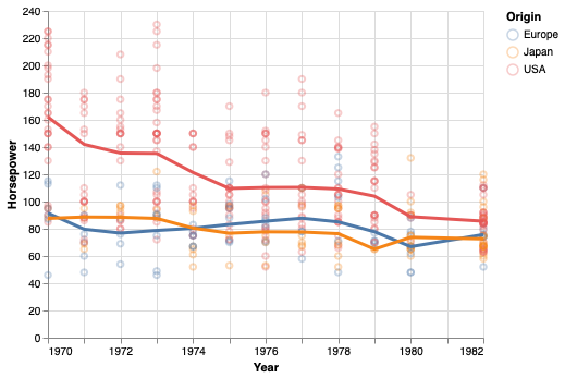
Sometimes it is difficult to find a single regression equation that describes the entire data set. Instead, you can fit multiple equations (usually linear and quadratic) to smaller subsets of the data, and add them together to get the final line. This is conceptually similar to a moving/rolling average, which also only uses part of the data to create the trend line.
points +  points.transform_loess(
    'Year', 'Horsepower', groupby=['Origin']).mark_line(size=3)
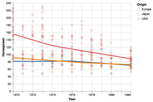
The bandwidth parameter controls how much the loess fit should be influenced by local variation in the data, similar to the effect of the bandwidth parameter for a KDE.
# The default is 0.3 and 1 is often close to a linear fit.
points +  points.transform_loess(
    'Year', 'Horsepower', groupby=['Origin'], bandwidth=0.8).mark_line(size=3)
When to choose which trendline?#
If it is important that the line has values that are easy to interpret, choose a rolling mean. These are also the most straightforward trendlines when communicating data to a general audience.
If you think a simple line equation (e.g. linear) describes your data well, this can be advantageous since you would know that your data follows a set pattern, and it is easy to predict how the data behaves outside the values you have collected (of course still with more uncertainty the further away from your data you predict).
If you are mainly interested in highlighting a trend in the current data, and the two situations described above are not of great importance for your figure, then a loess line could be sutiabe. It has the advantage that it describes trends in data very “naturally”, meaning that it highlights patterns we would tend to highlight ourselves in qualitative assessment. It also less strict in its statistical assumption compared to e.g. a linear regression, so you don’t have to worry about finding the correct equation for the line, and assessing whether your data truly follows that equation globally.
ggplot#
Using the mean as a trendline.
%%R -i cars
ggplot(cars) +
    aes(x = Year,
        y = Horsepower,
        color = Origin) +
    geom_point() +
    geom_line(stat = 'summary', fun = 'mean')
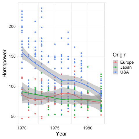
geom_smooth creates a loess trendline by default.
The shaded gray area is the 95% confidence interval of the fitted line.
%%R -i cars
ggplot(cars) +
    aes(x = Year,
        y = Horsepower,
        color = Origin) +
    geom_point() +
    geom_smooth()
R[write to console]: `geom_smooth()` using method = 'loess' and formula 'y ~ x'
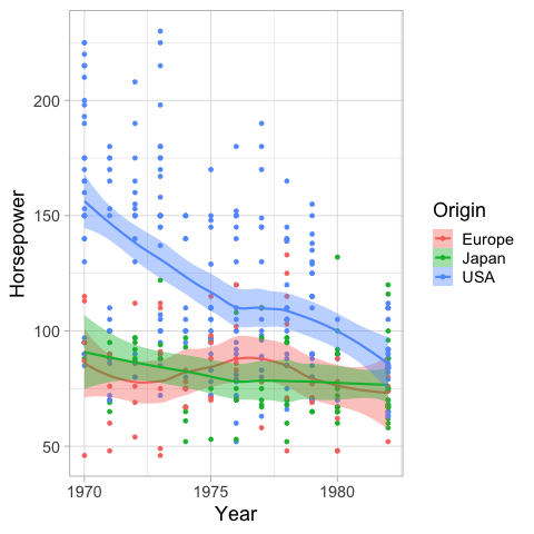
We can color the confidence interval the same as the lines.
%%R -i cars
ggplot(cars) +
    aes(x = Year,
        y = Horsepower,
        color = Origin,
        fill = Origin) +
    geom_point() +
    geom_smooth()
R[write to console]: `geom_smooth()` using method = 'loess' and formula 'y ~ x'
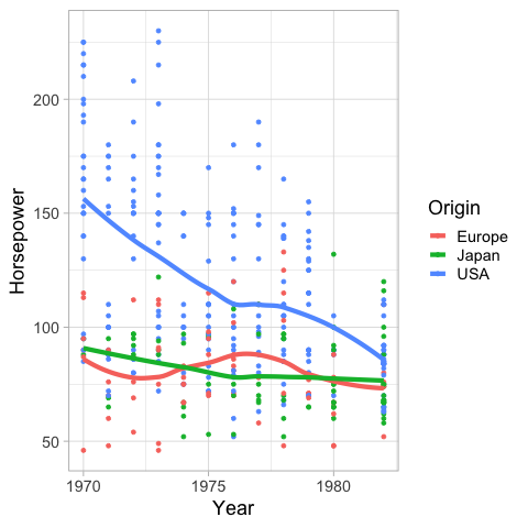
And also remove it.
%%R -i cars
ggplot(cars) +
    aes(x = Year,
        y = Horsepower,
        color = Origin,
        fill = Origin) +
    geom_point() +
    geom_smooth(se = FALSE, size = 2)
R[write to console]: `geom_smooth()` using method = 'loess' and formula 'y ~ x'
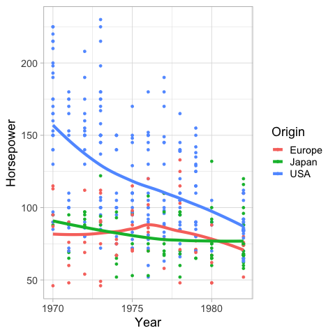
Similar to the bandwidth in Altair,
you can set the span in geom_smooth
to alter how sensitive the loess fit is to local variation.
%%R
ggplot(cars) +
    aes(x = Year,
        y = Horsepower,
        color = Origin,
        fill = Origin) +
    geom_point() +
    geom_smooth(se = FALSE, size = 2, span = 1)
R[write to console]: `geom_smooth()` using method = 'loess' and formula 'y ~ x'
If you wnat a linear regression instead of loess
you can set the method to lm (linear model).
%%R
ggplot(cars) +
    aes(x = Year,
        y = Horsepower,
        color = Origin,
        fill = Origin) +
    geom_point() +
    geom_smooth(se = FALSE, size = 2, method = 'lm')
R[write to console]: `geom_smooth()` using formula 'y ~ x'
Confidence intervals#
To show the confidence interval of the points as a band,
we can use mark_errorband.
By default this mark show the standard deviation of the points,
but we can change the extent to use bootstrapping on the sample data
to construct the 95% confidence interval of the mean.
points.mark_errorband(extent='ci')
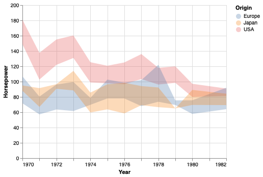
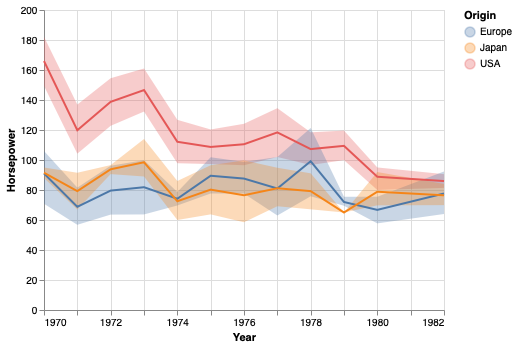
We can add in the mean line.
points.mark_errorband(extent='ci') + points.encode(y='mean(Horsepower)').mark_line()
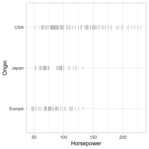
We can use mark_errorbar to show the standard deviation or confidence interval around a single point.
alt.Chart(cars).mark_errorbar(extent='ci', rule=alt.LineConfig(size=2)).encode(
    x='Horsepower',
    y='Origin')
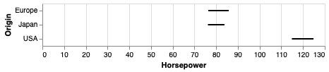
Also here, it is helpful to include an indication of the mean.
err_bars = alt.Chart(cars).mark_errorbar(extent='ci', rule=alt.LineConfig(size=2)).encode(
    x='Horsepower',
    y='Origin')

err_bars + err_bars.mark_point(color='black').encode(x='mean(Horsepower)')
An particularly usful visualization is to combine the above with an indication of the distribution of the data, e.g. as a faded violinplot in the background or as faded marks for all observations. This gives the reader a chance to study the raw data in addition to seeing the mean and its certainty.
err_bars = alt.Chart(cars).mark_errorbar(extent='ci', rule=alt.LineConfig(size=2)).encode(
    x='Horsepower',
    y='Origin')

(err_bars.mark_tick(color='lightgrey')
 + err_bars
 + err_bars.mark_point(color='black').encode(x='mean(Horsepower)'))
ggplot#
In ggplot, we can create confidence bands via geom_ribbon.
Previously we have passed specific statistic summary functions to the fun parameter,
but here we will use fun.data because we need both the lower and upper bond
of where to plot the ribbon.
Whereas fun only allows functions that return a single value which decides where to draw the point on the y-axis
(such as mean),
fun.data allows functions to return three values (the min, middle, and max y-value).
The mean_cl_boot function is especially helpful here,
since it returns the upper and lower bound of the bootstrapped CI
(and also the mean value, but that is not used by geom_ribbon).
You need the Hmisc package installed in order to use mean_cl_boot,
if you don’t nothing will show up but you wont get an error,
so it can be tricky to realize what is wrong.
%%R -w 600
ggplot(cars) +
    aes(x = Year,
        y = Horsepower,
        color = Origin,
        fill = Origin) +
    geom_ribbon(stat = 'summary', fun.data = mean_cl_boot, alpha=0.5, color = NA)
    # `color = NA` removes the ymin/ymax lines and shows only the shaded filled area
We can add a line for the mean here as well.
%%R -w 600
ggplot(cars) +
    aes(x = Year,
        y = Horsepower,
        color = Origin,
        fill = Origin) +
    geom_line(stat = 'summary', fun = mean) +
    geom_ribbon(stat = 'summary', fun.data = mean_cl_boot, alpha=0.5, color = NA)
To plot the confidence interval around a single point,
we can use geom_pointrange,
which also plots the mean
(so it uses all three values return from mean_cl_boot).
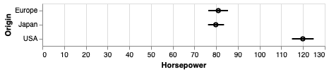
%%R
ggplot(cars) +
    aes(x = Horsepower,
        y = Origin) +
    geom_pointrange(stat = 'summary', fun.data = mean_cl_boot)
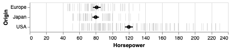
And finally we can plot the observations in the backgound here.
%%R
ggplot(cars) +
    aes(x = Horsepower,
        y = Origin) +
    geom_point(shape = '|', color='grey', size=5) +
    geom_pointrange(stat = 'summary', fun.data = mean_cl_boot, size = 0.7)
%%R
ggplot(cars) +
    aes(x = Horsepower,
        y = Origin) +
    geom_violin(color = NA, fill = 'steelblue', alpha = 0.4) +
    geom_pointrange(stat = 'summary', fun.data = mean_cl_boot, size = 0.7)
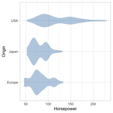
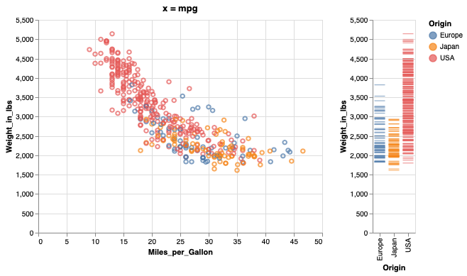
Figure composition in Altair#
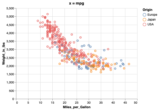
Let’s create two figures to layout together. The titles here are a bit redundant, they’re just mean to facilitate spotting which figure goes where in the multi-panel figure.
from vega_datasets import data
cars = data.cars()
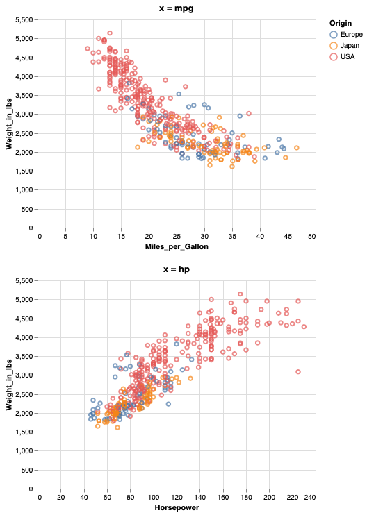
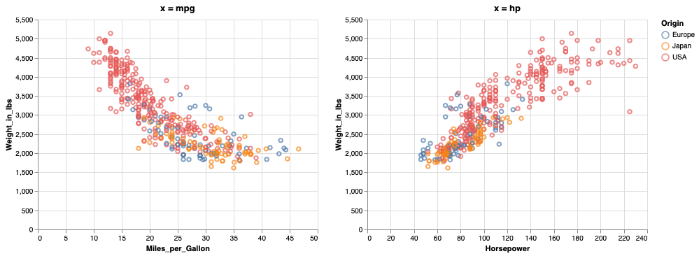
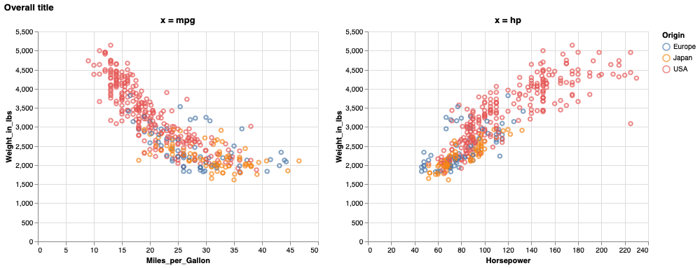
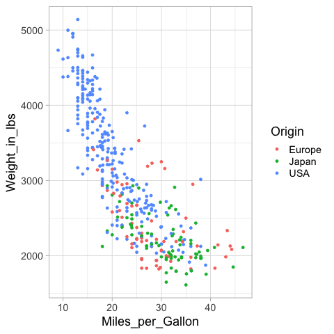
mpg_weight = alt.Chart(cars, title='x = mpg').mark_point().encode(
x=alt.X('Miles_per_Gallon'),
y=alt.Y('Weight_in_lbs'),
color='Origin')
mpg_weight
If a variable is shared between two figures, it is a good idea to have it on the same axis. This makes it easier to compare the relationship with the previous plot.
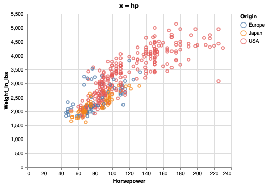
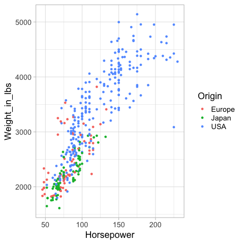
hp_weight = alt.Chart(cars, title='x = hp').mark_point().encode(
    x=alt.X('Horsepower'),
    y=alt.Y('Weight_in_lbs'),
    color='Origin')
hp_weight
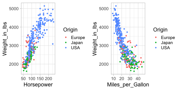
To concatenate plots vertically, we can use the ampersand operator.
mpg_weight & hp_weight
To concatenate horizontally, we use the pipe operator.
mpg_weight | hp_weight
To add an overall title to the figure,
we can use the properties method.
We need to surround the plots with a parentheis
to show that we are using properties of the composed figures
rather than just hp_weight one.
(mpg_weight | hp_weight).properties(title='Overall title')
In addition to & and |,
we could use the functions vconcat and hconcat.
You can use what you find the most convenient,
this is how to add a title with one of those functions.
alt.hconcat(mpg_weight, hp_weight, title='Overall title')

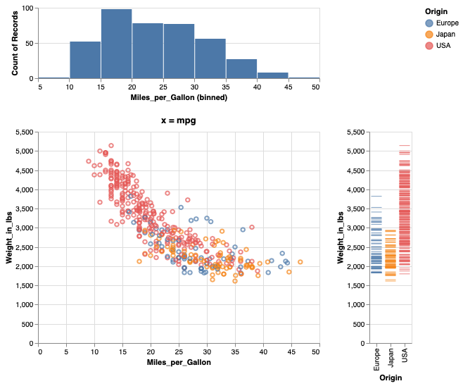
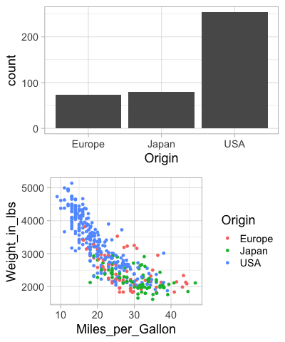
We can also build up a figure with varying sizes for the different panels, e.g. adding marginal distribution plots to a scatter plot.
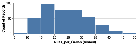
mpg_hist = alt.Chart(cars).mark_bar().encode(
    alt.X('Miles_per_Gallon', bin=True),
    y='count()').properties(height=100)
mpg_hist
weight_ticks = alt.Chart(cars).mark_tick().encode(
    x='Origin',
    y='Weight_in_lbs',
    color='Origin')
weight_ticks
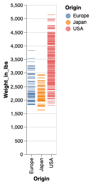
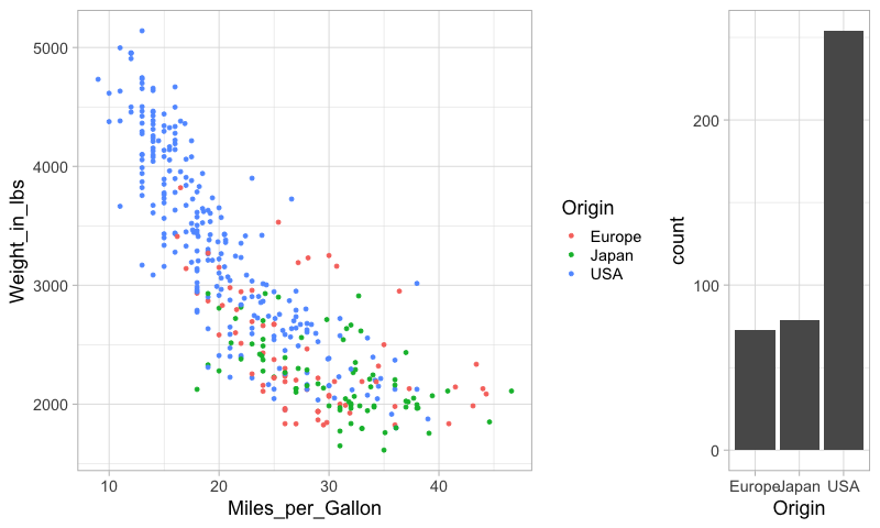
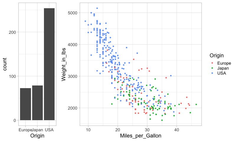
mpg_weight | weight_ticks
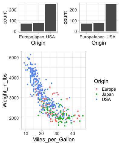
Just adding operations after each other can lead to the wrong grouping of the panels in the figure.
mpg_hist & mpg_weight | weight_ticks
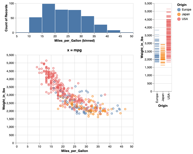
Adding parenthesis can indicate how to group the different panels.
mpg_hist & (mpg_weight | weight_ticks)
Saving figures in Altair#
Saving as HTML ensures that any interactive features are still present in the saved file.
combo = mpg_hist & (mpg_weight | weight_ticks)
combo.save('combo.html')
It is also possible to save as non-interactive formats
such as png, svg, and pdf.
The png and pdf formats can be a bit tricky to getto work correctly,
as they depend on other packages.
Installation for these should have been taken care of via installing altair_saver,
but there are additional instruction in the github repo in case that didn’t work.
# To save a file as png, simply do:

# combo.save('combo.png')
The resolution/size of the saved image can be controlled via the scale_factor parameter.
#combo.save('combo-hires.png', scale_factor=3)
Figure composition in ggplot#
%%R
library(tidyverse)
%%R -i cars
mpg_weight <- ggplot(cars) +
    aes(x = Miles_per_Gallon,
        y = Weight_in_lbs,
        color = Origin) +
    geom_point()
mpg_weight
%%R -i cars
hp_weight <- ggplot(cars) +
    aes(x = Horsepower,
        y = Weight_in_lbs,
        color = Origin) +
    geom_point()
hp_weight
Laying out figures is not built into ggplot,
but the functionality is added in separate packages.
patchwork is similar to the operator-syntax we used with Altair,
and cowplot works similar to the concatenation functions in Altair.
Here I will be showing the latter,
but you’re free to use either
(“cow” are the author’s initials,
Claus O Wilke, the same person who wrote Fundamentals of Data Visualization).
%%R -w 600 -h 300
library(cowplot)

plot_grid(hp_weight, mpg_weight)
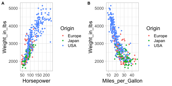
Panels can easily be labeled.
%%R -w 600 -h 300
plot_grid(hp_weight, mpg_weight, labels=c('A', 'B'))

And this can even be automated.
%%R -w 600 -h 300
plot_grid(hp_weight, mpg_weight, labels='AUTO')
Let’s create a composite figure with marginal distribution plots.
%%R
ggplot(cars) +
    aes(x = Origin) +
    geom_bar()
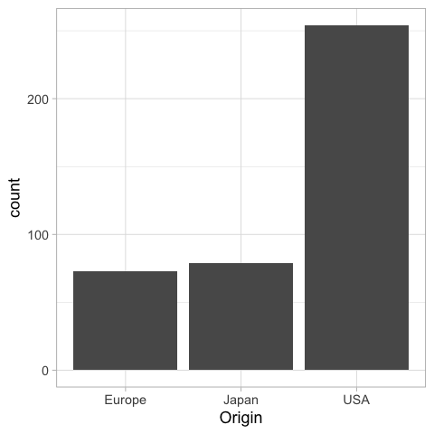
If we were to present this barplot as a communication firgure, the bars should not be that wide. It is more visually appealing with narrower bars.
%%R -w 200
ggplot(cars) +
    aes(x = Origin) +
    geom_bar()
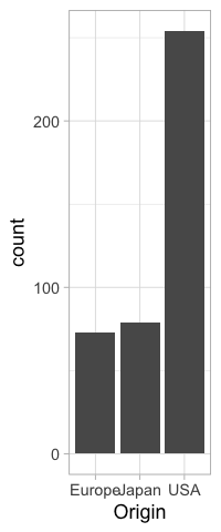
%%R -w 200
origin_count <- ggplot(cars) +
    aes(x = Origin) +
    geom_bar()
origin_count

To set the widths of figures in the composition plot,
we can use rel_widths.
%%R -w 800
plot_grid(mpg_weight, origin_count)
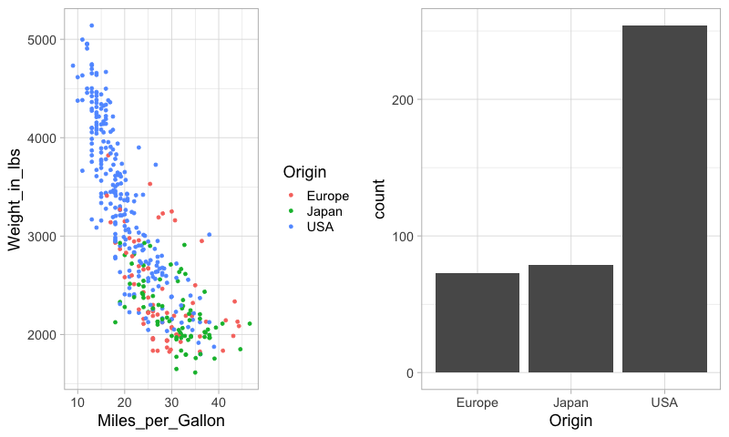
%%R -w 800
plot_grid(mpg_weight, origin_count, rel_widths=c(3, 1))
It is not that nice to see the legend between the plots, so lets reorder them.
%%R -w 800
plot_grid(origin_count, mpg_weight, rel_widths=c(1, 3))
To concatenate vertically, we set the number of columns to 1.
%%R -w 400
plot_grid(origin_count, mpg_weight, ncol=1)
Finally, we can nest plot grids within each other.
%%R -w 400
top_row <- plot_grid(origin_count, origin_count)
plot_grid(top_row, mpg_weight, ncol=1, rel_heights=c(1,2))
There are some more tricks in the readme,
including how to add a common title for the figures
via ggdraw.
Saving figures in ggplot#
The ggsave functions saves the most recent plot to a file.
%%R
grid <- plot_grid(top_row, mpg_weight, ncol=1)
ggsave('grid.png')
R[write to console]: Saving 6.67 x 6.67 in image
You can also specify which figure to save.
%%R
ggsave('grid.png', grid)
R[write to console]: Saving 6.67 x 6.67 in image
Setting the dpi controls the resolution of the saved figure.
%%R
grid <- plot_grid(top_row, mpg_weight, ncol=1)
ggsave('grid2.png', dpi=96)
R[write to console]: Saving 6.67 x 6.67 in image
You can save to PDF and SVG as well.
%%R
grid <- plot_grid(top_row, mpg_weight, ncol=1)
ggsave('grid2.pdf')
R[write to console]: Saving 6.67 x 6.67 in image