Lecture 1
Contents
Lecture 1#
Lecture learning goals#
By the end of the lecture you will be able to:
Explain the importance of data visualizations.
Describe the differences between Imperative and Declarative programming.
Create basic visualizations in Altair.
Readings#
Data Visualization: A practical introduction by Kieran Healy, Section 1 - 1.2 (inclusive)
Or his video on the same topic until the “Perception” slide around minute 27.
What is data visualization?#
At its core, data visualization is about representing numbers with graphical components. These include many components, such as position, area, color, etc, Picking the most appropriate component for you data can be tricky, but fortunately there is research on which are the most appropriate for different situations as we will see later.
Why bother visualizing data instead of showing raw numbers?#
Think about it, numbers have been around for about 5,000 years. Visual systems, on the other hand, have undergone refinement for over 500,000,000 years by training with a lethal, evolutionary cost function. While we need to train ourselves to recognize structure in numerical data, we have evolved to instinctively recognize visual patterns and to accurately judge properties such as colors and distances between objects.
Drawing upon this complex build-in apparatus, we can arrive at conclusion much faster by glancing at visual representations of data rather than numerical representations. For example, have a look at the four sets of numbers in the table below, put together by statistician Francis Anscombe in the 70s. Can you see how the sets are different from each other by just glancing at the table?
| I | II | III | IV | ||||
|---|---|---|---|---|---|---|---|
| x | y | x | y | x | y | x | y |
| 10.0 | 8.04 | 10.0 | 9.14 | 10.0 | 7.46 | 8.0 | 6.58 |
| 8.0 | 6.95 | 8.0 | 8.14 | 8.0 | 6.77 | 8.0 | 5.76 |
| 13.0 | 7.58 | 13.0 | 8.74 | 13.0 | 12.74 | 8.0 | 7.71 |
| 9.0 | 8.81 | 9.0 | 8.77 | 9.0 | 7.11 | 8.0 | 8.84 |
| 11.0 | 8.33 | 11.0 | 9.26 | 11.0 | 7.81 | 8.0 | 8.47 |
| 14.0 | 9.96 | 14.0 | 8.10 | 14.0 | 8.84 | 8.0 | 7.04 |
| 6.0 | 7.24 | 6.0 | 6.13 | 6.0 | 6.08 | 8.0 | 5.25 |
| 4.0 | 4.26 | 4.0 | 3.10 | 4.0 | 5.39 | 19.0 | 12.50 |
| 12.0 | 10.84 | 12.0 | 9.13 | 12.0 | 8.15 | 8.0 | 5.56 |
| 7.0 | 4.82 | 7.0 | 7.26 | 7.0 | 6.42 | 8.0 | 7.91 |
| 5.0 | 5.68 | 5.0 | 4.74 | 5.0 | 5.73 | 8.0 | 6.89 |
No? What about if I showed you the commonly used numerical summaries of the data? Tough luck, all the summary statistics in the table below are the same for each of these four set.
| Property | Value | Accuracy |
|---|---|---|
| Mean of x | 9 | exact |
| Sample variance of x : | 11 | exact |
| Mean of y | 7.50 | to 2 decimal places |
| Sample variance of y : | 4.125 | ±0.003 |
| Correlation between x and y | 0.816 | to 3 decimal places |
| Linear regression line | y = 3.00 + 0.500x | to 2 and 3 decimal places, respectively |
| Coefficient of determination of the linear regression : | 0.67 | to 2 decimal places |


So if you can’t really see any patterns in the data and the statistical summaries are the same, that must mean that the four sets are pretty similar, right? Sounds about right to me so let’s go ahead and plot them to have a quick look and…
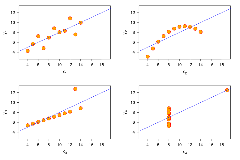
… what the… how… there must be something wrong, right? Well what is wrong is that humans are not good at detecting patterns in raw numbers, and we don’t have good intuition about which combination of numbers can contribute to the same statistical summaries. But guess what we excel at? Detecting visual patterns! It is immediately clear to us how these sets of numbers differ once they are shown as graphical objects instead of textual objects. And this is one of the main reasons why data visualization is such a powerful tool for data exploration and communication.
For a more recent, dynamic, and avian illustration of this concept, check out the Datasaurus GIF below:

As with most powerful tools, visualization can be dangerous if wielded the wrong way. It can cause misinterpretations of the data, where the person creating the visualization has not taken into account how the human visual cortex will process a particular plot or (rarely) actively tries to mislead readers by manipulating our intuition.
To guard against both these issues, it is important that we know what common visualization traps we might encounter in the wild. This has been written about extensively, and one good introduction is the book Data Visualization: A practical introduction by Kieran Healy, Section 1 - 1.2 (to be clear this notation means that the entire 1.2 section is included, so you stop when you reach the 1.3 section).
He starts discussing some of the things we mentioned above, but in more detail and also covers visualization mistakes. Please go ahead and read his sections, or or his video on the same topic until the “Perception” slide around minute 27. The key takeaways are the general design considerations that goes into visualizing data, so you don’t have to bother remembering minute details, such as which boxplot was Edward Tufte’s favorite.
After you have read/watched the above, continue to the next section below.
Creating plots in R and Python#
There is a plethora of visualization tools in each language, we start with a bird’s eye view and thenn zoom in to the parts we’re interested in.
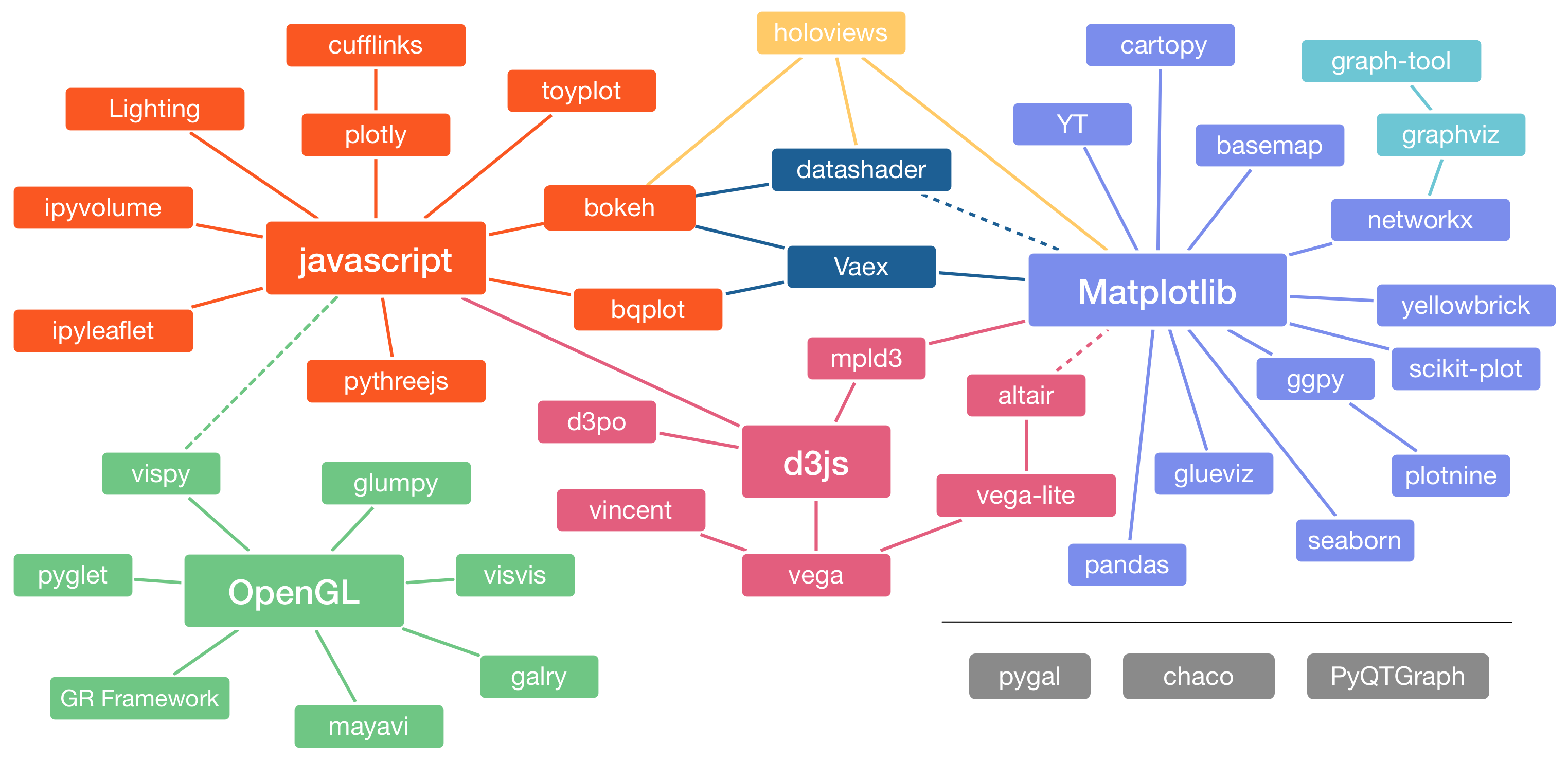 Image Credit: Jake VanderPlas
The R and Python visualization landscapes (Zoomed in)#
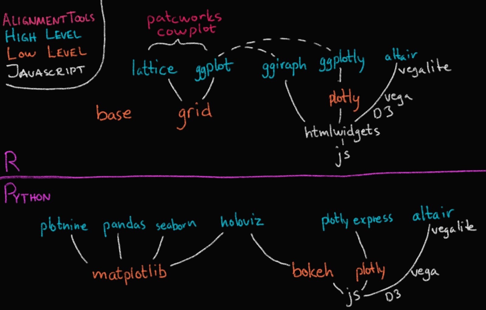 Image Credit: Joel Ostblom, UBC-V MDS Post-doc
In this course we will focus on Altair and ggplot, and as you can see in the image above, these are both high level (or declarative) visualization libraries.
High level declarative vs low level imperative visualization tools#
The text below is largely from the University of Washington’s Altair course (Copyright © 2019, University of Washington) and has been restructured and modified to fit the format of this course.
By declarative, we mean that you can provide a high-level specification of what you want the visualization to include, in terms of data, graphical marks, and encoding channels, rather than having to specify how to implement the visualization in terms of for-loops, low-level drawing commands, etc. For example, you would say “color my data by the column ‘country’” instead of “go through this data frame and plot any observations of country1 in blue, any observations of country2 in red, etc”.
Declarative visualization tools lets you think about data and relationship, rather than plot construction details. A key idea is that you declare links between data fields and visual encoding channels, such as the x-axis, y-axis, color, etc. The rest of the plot details are handled automatically. Building on this declarative plotting idea, a surprising range of simple to sophisticated visualizations can be created using a concise grammar. Thanks to this functional way of interfaces with data, only minimal changes are required if the underlying data change or to change the type of plot.
Two of the most prominent declarative statistical visualization libraries are Altair (Python and R) and ggplot (R but a Python clone called “plotnine” exists as well). These offer a powerful and concise visualization grammar for quickly building a wide range of statistical graphics. In brief, you first create a canvas/chart, then you encode your data variables as different dimensions in this chart (x, y, color, etc) and add geometric marks to represent the data (points, lines, etc). You can see an illustration of this in the image below, together with how ggplot (top) and altair (bottom) uses the grammatical components in its syntax. The exact syntax is slightly different, but the overall structure very much the same:
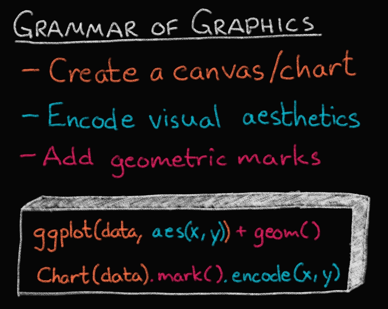
Image Credit: Joel Ostblom, UBC-V MDS Post-doc
In the previous image of the plotting landscape,
you can see that there are other high level tools as well.
While these are also more convenient than low level tools,
their syntax is slightly different from Altair and ggplot,
and you express yourself more in terms of a topdown approach
starting with which plot to build,
rather than building the plot bottom up starting with the data
(e.g., you say histogram(data, x, y, color),
instead of canvas(data).mark_bar().encode(bin(x), y, color)).
Both approaches have their advantages,
and building from small elements in grammar
is flexible and powerful which is why we focus on it in this course.
Finally,
you can see that there are specific alignment tools
for putting ggplot figures together,
whereas this functionality is built into Altair.
Enough talking, let’s code!
Using a graphical grammar in Altair (and ggplot)#
# This is a setup cell so that Python and R can run in the same Jupyter notebook
# and so that the text of plots is bigger by default.
import altair as alt

# Set a bigger default font size for plots
def bigger_font():
    return {
        'config': {
            'view': {'continuousWidth': 400, 'continuousHeight': 300},
            'legend': {'symbolSize': 14, 'titleFontSize': 14, 'labelFontSize': 14},
            'axis': {'titleFontSize': 15, 'labelFontSize': 12},
            'encoding': {'x': {'scale': {'zero': False}}}}}
alt.themes.register('bigger_font', bigger_font)
alt.themes.enable('bigger_font')

# Ensure that altair plots show up in the exported HTML
# Save a vega-lite spec and a PNG blob for each plot in the notebook
#alt.renderers.enable('mimetype')
# Handle large data sets without embedding them in the notebook
#alt.data_transformers.enable('data_server')

# Load the extension so that we can use the %%R cell magic
%load_ext rpy2.ipython
%%R
# The line above is the "R" cell magic, which mean we can write R code in this cell
suppressPackageStartupMessages(library(tidyverse))

# Set a bigger default font size for plots
theme_set(theme_gray(base_size = 18))
R[write to console]: Error in (function (filename = "Rplot%03d.png", width = 480, height = 480,  :
  Graphics API version mismatch
---------------------------------------------------------------------------
RRuntimeError                             Traceback (most recent call last)
Input In [2], in <cell line: 1>()
----> 1 get_ipython().run_cell_magic('R', '', '# The line above is the "R" cell magic, which mean we can write R code in this cell\nsuppressPackageStartupMessages(library(tidyverse))\n\n# Set a bigger default font size for plots\ntheme_set(theme_gray(base_size = 18))\n')

File /opt/hostedtoolcache/Python/3.9.13/x64/lib/python3.9/site-packages/IPython/core/interactiveshell.py:2358, in InteractiveShell.run_cell_magic(self, magic_name, line, cell)
   2356 with self.builtin_trap:
   2357     args = (magic_arg_s, cell)
-> 2358     result = fn(*args, **kwargs)
   2359 return result

File /opt/hostedtoolcache/Python/3.9.13/x64/lib/python3.9/site-packages/rpy2/ipython/rmagic.py:765, in RMagics.R(self, line, cell, local_ns)
    762 else:
    763     cell_display = CELL_DISPLAY_DEFAULT
--> 765 tmpd = self.setup_graphics(args)
    767 text_output = ''
    768 try:

File /opt/hostedtoolcache/Python/3.9.13/x64/lib/python3.9/site-packages/rpy2/ipython/rmagic.py:461, in RMagics.setup_graphics(self, args)
    457 tmpd_fix_slashes = tmpd.replace('\\', '/')
    459 if self.device == 'png':
    460     # Note: that %% is to pass into R for interpolation there
--> 461     grdevices.png("%s/Rplots%%03d.png" % tmpd_fix_slashes,
    462                   **argdict)
    463 elif self.device == 'svg':
    464     self.cairo.CairoSVG("%s/Rplot.svg" % tmpd_fix_slashes,
    465                         **argdict)

File /opt/hostedtoolcache/Python/3.9.13/x64/lib/python3.9/site-packages/rpy2/robjects/functions.py:203, in SignatureTranslatedFunction.__call__(self, *args, **kwargs)
    201         v = kwargs.pop(k)
    202         kwargs[r_k] = v
--> 203 return (super(SignatureTranslatedFunction, self)
    204         .__call__(*args, **kwargs))

File /opt/hostedtoolcache/Python/3.9.13/x64/lib/python3.9/site-packages/rpy2/robjects/functions.py:126, in Function.__call__(self, *args, **kwargs)
    124     else:
    125         new_kwargs[k] = cv.py2rpy(v)
--> 126 res = super(Function, self).__call__(*new_args, **new_kwargs)
    127 res = cv.rpy2py(res)
    128 return res

File /opt/hostedtoolcache/Python/3.9.13/x64/lib/python3.9/site-packages/rpy2/rinterface_lib/conversion.py:45, in _cdata_res_to_rinterface.<locals>._(*args, **kwargs)
     44 def _(*args, **kwargs):
---> 45     cdata = function(*args, **kwargs)
     46     # TODO: test cdata is of the expected CType
     47     return _cdata_to_rinterface(cdata)

File /opt/hostedtoolcache/Python/3.9.13/x64/lib/python3.9/site-packages/rpy2/rinterface.py:813, in SexpClosure.__call__(self, *args, **kwargs)
    806     res = rmemory.protect(
    807         openrlib.rlib.R_tryEval(
    808             call_r,
    809             call_context.__sexp__._cdata,
    810             error_occured)
    811     )
    812     if error_occured[0]:
--> 813         raise embedded.RRuntimeError(_rinterface._geterrmessage())
    814 return res

RRuntimeError: Error in (function (filename = "Rplot%03d.png", width = 480, height = 480,  :
  Graphics API version mismatch
Altair#
If you want to start with Altair, I’d suggest going through this notebook first which is a short tutorial on Altair. Below is a slightly different take on Altair with a different dataset.
Data#
Data in Altair and ggplot is built around “tidy” dataframes, which consists of a set of named data columns with one feature each and rows with one observation each. We will also regularly refer to data columns as data fields. We will start by discussing Altair for which we will often use datasets from the vega-datasets repository. Some of these datasets are directly available as Pandas data frames:
from vega_datasets import data

cars = data.cars()
cars
| Name | Miles_per_Gallon | Cylinders | Displacement | Horsepower | Weight_in_lbs | Acceleration | Year | Origin | |
|---|---|---|---|---|---|---|---|---|---|
| 0 | chevrolet chevelle malibu | 18.0 | 8 | 307.0 | 130.0 | 3504 | 12.0 | 1970-01-01 | USA |
| 1 | buick skylark 320 | 15.0 | 8 | 350.0 | 165.0 | 3693 | 11.5 | 1970-01-01 | USA |
| 2 | plymouth satellite | 18.0 | 8 | 318.0 | 150.0 | 3436 | 11.0 | 1970-01-01 | USA |
| 3 | amc rebel sst | 16.0 | 8 | 304.0 | 150.0 | 3433 | 12.0 | 1970-01-01 | USA |
| 4 | ford torino | 17.0 | 8 | 302.0 | 140.0 | 3449 | 10.5 | 1970-01-01 | USA |
| ... | ... | ... | ... | ... | ... | ... | ... | ... | ... |
| 401 | ford mustang gl | 27.0 | 4 | 140.0 | 86.0 | 2790 | 15.6 | 1982-01-01 | USA |
| 402 | vw pickup | 44.0 | 4 | 97.0 | 52.0 | 2130 | 24.6 | 1982-01-01 | Europe |
| 403 | dodge rampage | 32.0 | 4 | 135.0 | 84.0 | 2295 | 11.6 | 1982-01-01 | USA |
| 404 | ford ranger | 28.0 | 4 | 120.0 | 79.0 | 2625 | 18.6 | 1982-01-01 | USA |
| 405 | chevy s-10 | 31.0 | 4 | 119.0 | 82.0 | 2720 | 19.4 | 1982-01-01 | USA |
406 rows × 9 columns
Datasets in the vega-datasets collection can also be accessed via URLs. For more information about data frames - and some useful transformations to prepare Pandas data frames for plotting with Altair! - see the Specifying Data with Altair documentation.
The chart object#
The fundamental object in Altair is the Chart, which takes a data frame as a single argument alt.Chart(cars).
Marks#
With a chart object in hand, we can now specify how we would like the data to be visualized. We first indicate what kind of geometric mark we want to use to represent the data. We can set the mark attribute of the chart object using the the Chart.mark_* methods.
For example, we can show the data as a point using mark_point():
alt.Chart(cars).mark_point()
Here the rendering consists of one point per row in the dataset, all plotted on top of each other, since we have not yet specified positions for these points.
To visually separate the points, we can map various encoding channels, or channels for short, to fields in the dataset. For example, we could encode the field Miles_per_Gallon of the data using the x channel, which represents the x-axis position of the points. To specify this, use the encode method:
alt.Chart(cars).mark_point().encode(
    x='Miles_per_Gallon')
The encode() method builds a key-value mapping between encoding channels (such as x, y, color, shape, size, etc.) to fields in the dataset, accessed by field name. For Pandas data frames, Altair automatically determines an appropriate data type for the mapped column, which in this case is the nominal type, indicating unordered, categorical values.
Though we’ve now separated the data by one attribute, we still have multiple points overlapping within each category. Let’s further separate these by adding an x encoding channel:
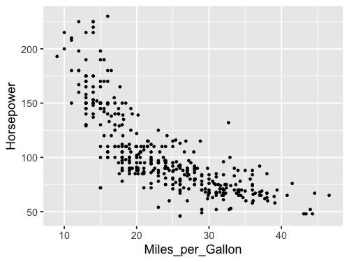
alt.Chart(cars).mark_point().encode(
    x='Miles_per_Gallon',
    y='Horsepower')
We can specify which column we want to color the points by and Altair will automatically figure out an appropriate colorscale to use.
alt.Chart(cars).mark_point().encode(
    x='Miles_per_Gallon',
    y='Horsepower',
    color='Weight_in_lbs')
Since we used a column with numerical (called “quantitative”) data, a continuous, gradually increasing colorscale was used. If we instead choose a color with categorical (called “nominal”) data, Altair will smartly pick a suitable colorscale with distinct colors.
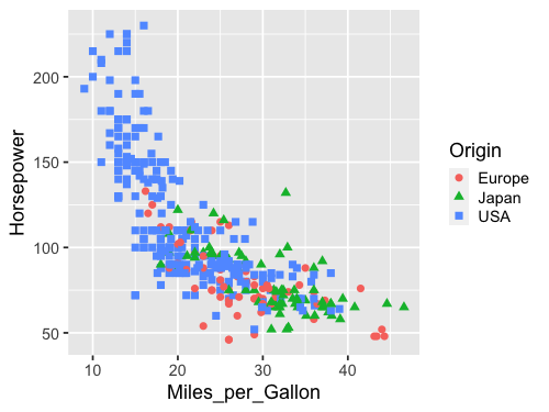
alt.Chart(cars).mark_point().encode(
    x='Miles_per_Gallon' ,
    y='Horsepower',
    color='Origin')
We can encode shapes aesthetics the same way.
alt.Chart(cars).mark_point().encode(
    x='Miles_per_Gallon' ,
    y='Horsepower',
    color='Origin',
    shape='Origin')
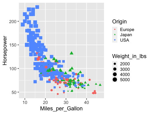
Another common encoding aestheic is size.
alt.Chart(cars).mark_point().encode(
    x='Miles_per_Gallon' ,
    y='Horsepower',
    color='Origin',
    shape='Origin',
    size='Weight_in_lbs')
This plot is quite messy, there are too many things going on to be able to see the variation in weight. If you scroll up to the plot where we encoded weight in the color channel, you can see that the plot is much clearer. There is plenty of research on which channels are best for what features, which we will learn more about next lecture.
ggplot#
%%R -i cars -w 500 -h 375
# -i "imports" an object from Python to use in R, here the `cars` df
# The other options set the plot size,
# you can do this for the same effect in an R kernel:
# options(repr.plot.width=7, repr.plot.height=5)

ggplot(cars, aes(x = Miles_per_Gallon, y = Horsepower)) +
    geom_point()
The default ggplot style is quite different from that of Altair. Both have advantages, and they are easy to customize to look however you want, which we will also get into later. Note that ggplot does not including the origin of the plot (x=0, y=0) by default, but Altair does for many cases.
Let’s encode the same aesthetics as for Altair, and see how the syntax differs
%%R -w 500 -h 375
# Since `cars` is now already a defined varible in the R kernel, we don't need `-i` again

ggplot(cars, aes(x = Miles_per_Gallon, y = Horsepower, color = Weight_in_lbs)) +
    geom_point()

As with Altair, ggplot chooses an appropriate continuous color scale for the quantitative data, although it start from dark instead of light, which could be related to the different choice of background color. Notice also the difference in how the legend is added, in Altair the overall width of the figure was increased, whereas here the legend takes part of the figure width from the canvas, which is made narrower.
When changing to a nominal feature, the colorscale changes to a discrete one instead of continuous.
%%R -w 500 -h 375
ggplot(cars, aes(x = Miles_per_Gallon, y = Horsepower, color = Origin)) +
    geom_point()

Shape can be encoded like before
%%R -w 500 -h 375
ggplot(cars, aes(x = Miles_per_Gallon, y = Horsepower, color = Origin, shape = Origin)) +
    geom_point(size=3)
And also size.
%%R -w 500 -h 375
ggplot(cars, aes(x = Miles_per_Gallon, y = Horsepower, color = Origin,
                 shape = Origin, size = Weight_in_lbs)) +
    geom_point()
Line charts#
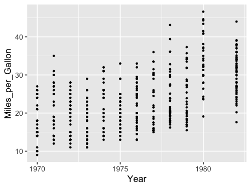
We can use the point chart to visualize trends over time, such as how the miles per gallon has changes over the years.
alt.Chart(cars).mark_point().encode(
    x='Year',
    y='Miles_per_Gallon')
However, trends are often more effectively visualized with lines, so let’s try switching our mark.
alt.Chart(cars).mark_line().encode(
    x='Year',
    y='Miles_per_Gallon')
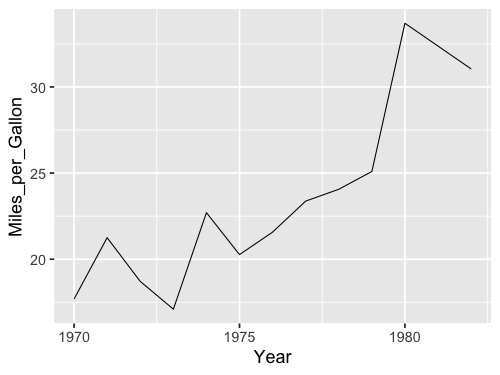
Oh oh, something is wrong. Because there are multiple values per year, the line goes between all of them vertically and it just looks really odd. Instead, what we want is to aggregate the data, and show for example how the mean has changed over time so that there is one point per year. We could wrangle the data manually.
yearly_avg_gallons = cars.groupby('Year')['Miles_per_Gallon'].mean().reset_index()
yearly_avg_gallons
| Year | Miles_per_Gallon | |
|---|---|---|
| 0 | 1970-01-01 | 17.689655 |
| 1 | 1971-01-01 | 21.250000 |
| 2 | 1972-01-01 | 18.714286 |
| 3 | 1973-01-01 | 17.100000 |
| 4 | 1974-01-01 | 22.703704 |
| 5 | 1975-01-01 | 20.266667 |
| 6 | 1976-01-01 | 21.573529 |
| 7 | 1977-01-01 | 23.375000 |
| 8 | 1978-01-01 | 24.061111 |
| 9 | 1979-01-01 | 25.093103 |
| 10 | 1980-01-01 | 33.696552 |
| 11 | 1982-01-01 | 31.045000 |
And then plot the wrangled dataframe.
alt.Chart(yearly_avg_gallons).mark_line().encode(
    x='Year',
    y='Miles_per_Gallon')
Data transforms in Altair#
But instead of doing this two step process with pandas, we could aggregate right inside Altair!
To get the mean of a column, wrap it in a string that says 'mean()':
alt.Chart(cars).mark_line().encode(
    x='Year',
    y='mean(Miles_per_Gallon)')
That is a convenient short cut! Many common aggregations/transformations are available via this syntax, more info in the documentation including a table with all available aggregations.
In general, I do NOT recommend you do this for anything more complex than simple means and sums! It’s much better for debugging to wrangle/process your data first and then plot it.
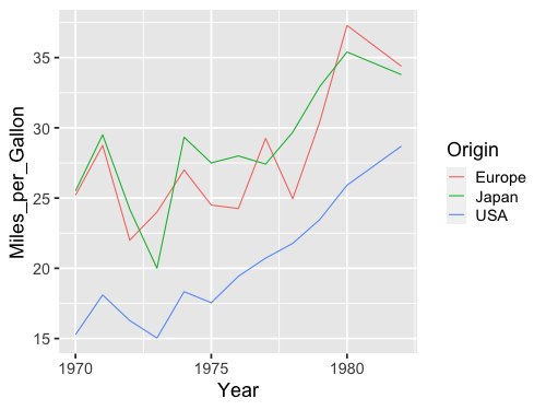
What happens if we add a splash of color?
alt.Chart(cars).mark_line().encode(
    x='Year',
    y='mean(Miles_per_Gallon)',
    color='Origin')
Now we got three lines!
Just like with a pandas groupby() operation,
Altair understands that we want to take the mean of each group
in the color channel separately.
Ok let’s see how this looks with ggplot. First the dots…
%%R -w 500 -h 375
ggplot(cars, aes(x = Year, y = Miles_per_Gallon)) +
    geom_point()
Then we get the same issue with the lines:
%%R -w 500 -h 375
ggplot(cars, aes(x = Year, y = Miles_per_Gallon)) +
    geom_line()

We could wrangle the data here as well.
%%R -w 500 -h 375
yearly_avg_gallons <- cars %>%
    group_by(Year) %>%
    summarize(Miles_per_Gallon = mean(Miles_per_Gallon, na.rm = TRUE))
yearly_avg_gallons
`summarise()` ungrouping output (override with `.groups` argument)
# A tibble: 12 x 2
   Year                Miles_per_Gallon
   <dttm>                         <dbl>
 1 1970-01-01 00:00:00             17.7
 2 1971-01-01 00:00:00             21.2
 3 1972-01-01 00:00:00             18.7
 4 1973-01-01 00:00:00             17.1
 5 1974-01-01 00:00:00             22.7
 6 1975-01-01 00:00:00             20.3
 7 1976-01-01 00:00:00             21.6
 8 1977-01-01 00:00:00             23.4
 9 1978-01-01 00:00:00             24.1
10 1979-01-01 00:00:00             25.1
11 1980-01-01 00:00:00             33.7
12 1982-01-01 00:00:00             31.0
%%R -w 500 -h 375
ggplot(yearly_avg_gallons, aes(x = Year, y = Miles_per_Gallon)) +
    geom_line()
But like in Altair,
there is a shortcut.
We can tell geom_line to show a summary of the points instead of all of them.
We then also needs to specify which kind of summary,
which in this case is the mean.
%%R -w 500 -h 375
ggplot(cars, aes(x = Year, y = Miles_per_Gallon)) +
    geom_line(stat = 'summary', fun = mean)

When we don’t specify any explicit value to stat,
the default is 'identity',
which you can think of as “show the exact identity/value for each data point,
don’t summarize them”.
Another way to write this in ggplot,
is using the stat_summary function instead of the geom_line function.
%%R -w 500 -h 375
ggplot(cars, aes(x = Year, y = Miles_per_Gallon)) +
    stat_summary(geom = "line", fun = mean)

These two approaches are identical in terms of functionality,
but you will see both when you search for help online,
so it is good to be aware of both.
Personally,
I like the geom_ approach
since that means we are always using the same function for plotting data,
regardless of whether we are plotting the raw identity value, or summaries.
This makes the visual appearance of the code cleaner and easier to read,
but you are free to use either.
This is a nice SO answer if you want to know more.
By using the color parameter,
ggplot can group lines according to unique values in a column in the dataframe
and summarize them once per group,
just like in Altair.
%%R -w 500 -h 375
ggplot(cars, aes(x = Year, y = Miles_per_Gallon, color = Origin)) +
    geom_line(stat = 'summary', fun = mean)
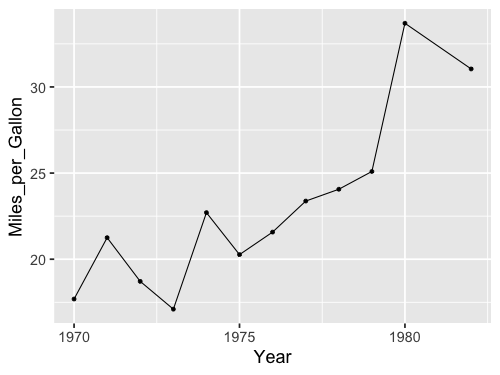
Combining marks via Layering#
As we’ve seen above, the Altair Chart object represents a plot with a single mark type. What about more complicated diagrams, involving multiple charts or layers? Using a set of view composition operators, Altair can take multiple chart definitions and combine them to create more complex views.
To augment this plot, we might like to add point marks for each averaged data point.
We can start by defining each chart separately: first a line plot, then a scatter plot. We can then use the layer operator to combine the two into a layered chart. Here we use the shorthand + (plus) operator to invoke layering:
line = alt.Chart(cars).mark_line().encode(
    x='Year',
    y='mean(Miles_per_Gallon)')

point = alt.Chart(cars).mark_point().encode(
    x='Year',
    y='mean(Miles_per_Gallon)')

line + point
We can also create this chart by reusing and modifying a previous chart definition! Rather than completely re-write a chart, we can start with the line chart, then invoke the mark_point method to generate a new chart definition with a different mark type:
line = alt.Chart(cars).mark_line().encode(
    x='Year',
    y='mean(Miles_per_Gallon)')

line + line.mark_point()
Could also have done mark_line(point=True),
but only a special case here so not generally useful.
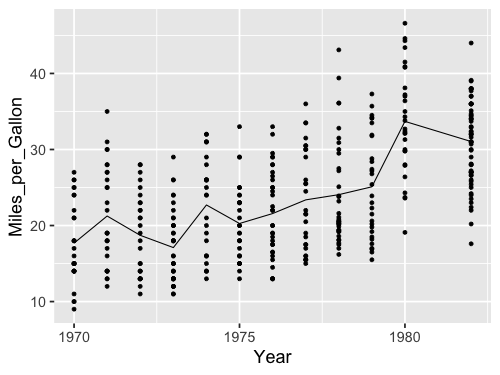
Can also layer with non averaged values.
line = alt.Chart(cars).mark_line().encode(
    x='Year',
    y='mean(Miles_per_Gallon)')

line + line.mark_point().encode(y='Miles_per_Gallon')
But note that the axis now has two labels, we will see how to change that next lecture. Adding color works as expected with layers.
line = alt.Chart(cars).mark_line().encode(
    x='Year',
    y='mean(Miles_per_Gallon)',
    color='Origin')

line + line.mark_point().encode(y='Miles_per_Gallon')
ggplot#
We could do it similarly as in Altair, by first saving to a variable and then adding the second geom.
%%R -w 500 -h 375
line <- ggplot(cars, aes(x = Year, y = Miles_per_Gallon)) +
    geom_line(stat = 'summary', fun = mean)
line + geom_point(stat = 'summary', fun = mean)

Or adding the second geom in the original plotting call.
%%R -w 500 -h 375
ggplot(cars, aes(x = Year, y = Miles_per_Gallon)) +
    geom_line(stat = 'summary', fun = mean) +
    geom_point(stat = 'summary', fun = mean)
%%R -w 500 -h 375
ggplot(cars, aes(x = Year, y = Miles_per_Gallon)) +
    geom_line(stat = 'summary', fun = mean) +
    geom_point()
Here we get only a singly axis label, so we don’t need to worry about changing it.
%%R -w 500 -h 375
ggplot(cars, aes(x = Year, y = Miles_per_Gallon, color=Origin)) +
    geom_line(stat = 'summary', fun = mean) +
    geom_point()
