551 Lec 8 - Notebook interactivity
You need to download this notebook to view images.
Lecture learning goals
By the end of the lecture you will be able to:
Share interactive visualizations without running a full dashboard or Python.
Learn how to use widgets in Altair
Philosophize deeply about the differences between plots and widgets (if there are any???)
Embed entire dashboards in notebooks using the Panel library
Use ggplotly for interactivity and animation.
Intro
In this lecture, we will see how we can share interactive visualization with people not running Python, without making them publicly available on a server. One way to do this is with authentication in Dash https://dash.plotly.com/authentication, but we can also develop embed interactivity in exported HTML notebooks, which can be emailed to your collaborators. This is great for smaller applications when there is no need for a full fledged dashboard
Reading in data
import altair as alt
from vega_datasets import data
import pandas as pd

movies = (
    data.movies()
    .drop(columns=['US DVD Sales', 'Director', 'Source', 'Creative Type'])
    .dropna(subset=['Running Time min', 'Major Genre', 'Rotten Tomatoes Rating', 'IMDB Rating', 'MPAA Rating'])
    .assign(Release_Year=lambda df: pd.to_datetime(df['Release Date']).dt.year)
    .reset_index(drop=True))
movies
---------------------------------------------------------------------------
ModuleNotFoundError                       Traceback (most recent call last)
<ipython-input-1-c38c9e1eb190> in <module>
      1 import altair as alt
----> 2 from vega_datasets import data
      3 import pandas as pd
      4
      5 movies = (

ModuleNotFoundError: No module named 'vega_datasets'
movies.info()
Bindings different elements to selection events in Altair
Legends
We saw before how we could use the bind parameter
of an altair selection
to link it to the legend of the plot.
select_genre = alt.selection_single(
    fields=['Major Genre'], # limit selection to the Major_Genre field
    bind='legend')

alt.Chart(movies).mark_circle().encode(
    x='Rotten Tomatoes Rating',
    y='IMDB Rating',
    color='Major Genre',
    tooltip='Title',
    opacity=alt.condition(select_genre, alt.value(0.7), alt.value(0.1))
).add_selection(select_genre)
Dropdowns
Binding to the legend doesn’t work that well in this case
since there are so many colors that the plot looks a bit messy.
Instead,
we could create a dropdown selection widget directly in Altair (alt.binding_select)
to let us choose categories without coloring the points.
Instead of binding alt.selection_single to the legend
we can pass along the dropdown we just created.
# The drop down requires an array of options, here we sort the genres alphabeitcally
genres = sorted(movies['Major Genre'].unique())
dropdown = alt.binding_select(options=genres)

select_genre = alt.selection_single(
    fields=['Major Genre'],
    bind=dropdown)

alt.Chart(movies).mark_circle().encode(
    x='Rotten Tomatoes Rating',
    y='IMDB Rating',
    tooltip='Title',
    opacity=alt.condition(select_genre, alt.value(0.7), alt.value(0.1))
).add_selection(select_genre)
select_genre.to_dict
# The drop down requires an array of options, here we sort the genres alphabeitcally
genres = sorted(movies['Major Genre'].unique())
dropdown = alt.binding_select(options=genres)

select_genre = alt.selection_single(
    fields=['Major Genre'],
    bind=dropdown)

alt.Chart(movies).mark_circle().encode(
    x='Rotten Tomatoes Rating',
    y='IMDB Rating',
#     tooltip='Title',
    tooltip=alt.value(select_genre.Major_Genre)
#     opacity=alt.condition(select_genre, alt.value(0.7), alt.value(0.1))
).add_selection(select_genre)
Let’s give our dropdown a better name and set the default value for the selection.
# The drop down requires an array of options, here we sort the genres alphabeitcally
genres = sorted(movies['Major Genre'].unique())
dropdown = alt.binding_select(name='Genre', options=genres)

select_genre = alt.selection_single(
    fields=['Major Genre'],
    bind=dropdown,
    init={'Major Genre': 'Comedy'})

alt.Chart(movies).mark_circle().encode(
    x='Rotten Tomatoes Rating',
    y='IMDB Rating',
    tooltip='Title',
    opacity=alt.condition(select_genre, alt.value(0.7), alt.value(0.1))
).add_selection(select_genre)
Dropdown and radio buttons
We could also add multiple widgets together, by binding them to different fields in the selection. Here we’re adding a radio button for the MPAA rating to the plot above.
# The drop down requires an array of options, here we sort the genres alphabetically
genres = sorted(movies['Major Genre'].unique())
dropdown_genre = alt.binding_select(name='Genre ', options=genres)

mpaa_rating = sorted(movies['MPAA Rating'].unique())
dropdown_mpaa = alt.binding_radio(name='MPAA Rating ', options=mpaa_rating)

select_genre_and_mpaa = alt.selection_single(
    fields=['Major Genre', 'MPAA Rating'],
    bind={'Major Genre': dropdown_genre, 'MPAA Rating': dropdown_mpaa})

alt.Chart(movies).mark_circle().encode(
    x='Rotten Tomatoes Rating',
    y='IMDB Rating',
    opacity=alt.condition(select_genre_and_mpaa, alt.value(0.7), alt.value(0.1))
).add_selection(select_genre_and_mpaa)
Here it would makes sense to sort the ratings according to their natural order instead of alphabetically, but they are roughly the same.
Slider
In addition to dropdowns and add radio buttons we can add sliders, and checkboxes,
but there are no multiselection dropdown or range sliders.
For multiple selections, we can instead use selection_multi on other plots or legends,
and for range sliders, we can use the selection_interval on another plot.
Let’s explore the slider.
slider = alt.binding_range(name='Tomatometer')
select_rating = alt.selection_single(
    fields=['Rotten Tomatoes_Rating'],
    bind=slider)

alt.Chart(movies).mark_circle().encode(
    x='Rotten Tomatoes Rating',
    y='IMDB Rating',
    tooltip='Title',
    opacity=alt.condition(select_rating, alt.value(0.7), alt.value(0.1))
).add_selection(select_rating)
The default behavior is to only filter points that are the exact values of the slider.
This is useful for selection widgets like the dropdown,
but for the slider we want to make comparisons
such as bigger and smaller than.
We can use alt.datum for this,
which let’s us use columns from the data
inside comparisons and more complex expression in Altair,
where it is not possible to write the column name only
(this makes it clear that is the the column name
and not just a string of the same name
that is referenced in the expression).
slider = alt.binding_range(name='Tomatometer')
select_rating = alt.selection_single(
    fields=['Rotten Tomatoes Rating'],
    bind=slider)

alt.Chart(movies).mark_circle().encode(
    x='Rotten Tomatoes Rating',
    y='IMDB Rating',
    opacity=alt.condition(
        alt.datum.Rotten_Tomatoes_Rating < select_rating.Rotten_Tomatoes_Rating,
        alt.value(0.7), alt.value(0.1))
).add_selection(select_rating)
We can set an explicit start value to avoid that all points appear unselected at the start, as well as define the range and step size for the slider.
slider = alt.binding_range(name='Tomatometer', min=10, max=60, step=5)
select_rating = alt.selection_single(
    fields=['Rotten Tomatoes Rating'],
    bind=slider,
    init={'Rotten_Tomatoes_Rating': 15})

alt.Chart(movies).mark_circle().encode(
    x='Rotten Tomatoes Rating',
    y='IMDB Rating',
    opacity=alt.condition(
        alt.datum.Rotten_Tomatoes_Rating < select_rating.Rotten_Tomatoes_Rating,
        alt.value(0.7), alt.value(0.1))
).add_selection(select_rating)
A more useful function of our slider would be to filter for the year.
slider = alt.binding_range(
    name='Year', step=1,
    min=movies['Release_Year'].min(), max=movies['Release_Year'].max())
select_rating = alt.selection_single(
    fields=['Release_Year'],
    bind=slider,
    init={'Release_Year': 2000})

alt.Chart(movies).mark_circle().encode(
    x='Rotten Tomatoes Rating',
    y='IMDB Rating',
    opacity=alt.condition(
        alt.datum.Release_Year < select_rating.Release_Year,
        alt.value(0.7), alt.value(0.1))
).add_selection(select_rating)
Driving slider-like selections from another plot instead
The plot above has several problems. Since there is no range slider, we would have to add a second slider to filter a range of values. And it is a bit unclear why the max is 2040, I guess there is a mislabeled movie, but can’t be sure. I also don’t get any information about which years have the most releases.
Due to Altair’s consistent interaction grammar, we can bind a similar selection event to a bar chart (or any chart type we want) instead of the slider, and change it to an interval to be able to select a range of points.
select_year = alt.selection_single(
    fields=['Release_Year'],
    init={'Release_Year': 2000})

bar_slider = alt.Chart(movies).mark_bar().encode(
    x='Release_Year',
    y='count()').properties(height=50).add_selection(select_year)

scatter_plot = alt.Chart(movies).mark_circle().encode(
    x='Rotten Tomatoes Rating',
    y='IMDB Rating',
    opacity=alt.condition(
        select_year,
        alt.value(0.7), alt.value(0.1)))

scatter_plot & bar_slider
It is great to be able to see where most movies are along the year axis! This bar plot is a much more informative driver of the selection event compared to the slider.
Now let’s switch it over an interval selection,
I will change from fields to encodings here,
to indicate that we only want to drag the interval along the x-axis
and use whatever column is on that axis.
I will also fix the formatting of the x-axis
to display years properly by using the year()
function on the date column directly
(similar to how we have used sum(), mean() etc before).
select_year = alt.selection_interval(encodings=['x'])

bar_slider = alt.Chart(movies).mark_bar().encode(
    x='year(Release_Date)',
    y='count()').properties(height=50).add_selection(select_year)

scatter_plot = alt.Chart(movies).mark_circle().encode(
    x='Rotten Tomatoes Rating',
    y='IMDB Rating',
    opacity=alt.condition(
        select_year,
        alt.value(0.7), alt.value(0.1)))

scatter_plot & bar_slider
This is related to the discussion we had in the first lecture around “what is a dashboard”, including examples on how shopping sites etc have many of the features that we traditionally associate with dashboards.
Now let’s ask ourselves “What is a widget?”. Is there any distinct difference between this small plot and the slider that disqualifies it from being called a widget? At this point, I think is mostly comes down to looks, so let’s make our bar selector appear more “widgety”.
select_year = alt.selection_interval(encodings=['x'])

# Filter out a few of the extreme value to make it look better
movies_fewer_years = movies.query('1994 < Release_Year < 2030')
bar_slider = (
    alt.Chart(movies_fewer_years).mark_bar().encode(
    alt.X('year(Release_Date)', title='', axis=alt.Axis(grid=False)),
    alt.Y('count()', title='', axis=None))
    .properties(height=20, width=100)
    .add_selection(select_year))

scatter_plot = alt.Chart(movies_fewer_years).mark_circle().encode(
    x='Rotten Tomatoes Rating',
    y='IMDB Rating',
    opacity=alt.condition(
        select_year,
        alt.value(0.7), alt.value(0.1)))

(scatter_plot & bar_slider).configure_view(strokeWidth=0)
If it looks like a duck… then it is a widget to me!
Multi-dimensional legends
Realizing the mutual properties between what we traditionally refer to as plots and legends,
means that it is almost only your imagination that sets the limits.
For example,
legends are usually one-dimensional,
but it doesn’t have to be that way!
Let’s make a three dimensional legend and link two of those dimensions to a selection.
We will use the Altair composition operator &
for triggering the condition only at the intersection of all selections.
movies_fewer_years.columns
# To make the final result  bit more elegant, I am filtering out a few low count categories
top_genres = movies_fewer_years['Major Genre'].value_counts()[:5].index
mpaa_rating_clean = [rate for rate in mpaa_rating if rate != 'Not Rated']
movies_clean = movies_fewer_years.query('Major Genre in @top_genres and MPAA Rating in @mpaa_rating_clean')

select_genre_and_mpaa = alt.selection_multi(
    fields=['Major Genre', 'MPAA Rating'],
    empty='all',
    nearest=True)

multidim_legend = alt.Chart(movies_clean, title=alt.TitleParams(text='Genre and Rating', fontSize=10, dx=-15)).mark_point(filled=True).encode(
    alt.X('MPAA Rating', title=''),
    alt.Y('Major Genre', title='', axis=alt.Axis(orient='right')),
    alt.Size('count()', legend=None),
    alt.Color('Major Genre', legend=None),
    opacity=alt.condition(select_genre_and_mpaa, alt.value(1), alt.value(0.2))
#     alt.Shape('MPAA_Rating', legend=None)
).add_selection(select_genre_and_mpaa).properties(width=100)


select_year = alt.selection_interval(empty='all', encodings=['x'])

# Filter out a few of the extreme value to make it look better
bar_slider = (
    alt.Chart(movies_clean, title=alt.TitleParams(text='Production year', fontSize=10, dx=-15)).mark_bar().encode(
    alt.X('year(Release_Date)', title='', axis=alt.Axis(grid=False),
          scale=alt.Scale(domain=[1995, 2012])),
    alt.Y('count()', title='', axis=None))
    .properties(height=20, width=100)
    .add_selection(select_year))

select_time = alt.selection_interval(empty='all', encodings=['x'])

# Filter out a few of the extreme value to make it look better
bar_slider_time = (
    alt.Chart(movies_clean, title=alt.TitleParams(text='Running time', fontSize=10, dx=-15)).mark_bar().encode(
    alt.X('Running Time min', title='', axis=alt.Axis(grid=False)),
    alt.Y('count()', title='', axis=None))
    .properties(height=20, width=100)
    .add_selection(select_time))

scatter_plot = alt.Chart(movies_clean).mark_circle().encode(
    x='Rotten Tomatoes Rating',
    y='IMDB Rating',
    color='Major Genre',
    tooltip='Title:N',
    opacity=alt.condition(
        select_year & select_genre_and_mpaa & select_time,
        alt.value(0.7), alt.value(0.1)))

(scatter_plot | (bar_slider & bar_slider_time & multidim_legend)).configure_view(strokeWidth=0)
Building advanced layouts like this is not the most common use case for notebook interactivity when it is focused on exploration. However, it can be nice to know how to implement these features when creating a more polished notebook to share with someone.
Using Panel to embed simple dashboards in notebooks
Although Altair’s interaction grammar is a joy to work with, it is limited to clientside interactions as we have discussed before. You can filter your data, but not perform any calculation you want like in Dash. Panel is full dashboarding library that also has the capability to be embedded in a notebook as HTML. The layout logic is based on bootstrap, so you will be organizing your app in rows and columns, just like we did in Dash.
Panel is not quite as feature filled as Dash,
and although it is capable of creating standalone dashboards,
it really shines when you just need a few widgets in your notebook,
especially when you want to share this with someone not running Python.
A good starting point to using panel is the interact function,
which is similar to how you have used ipywidgets in one of your other courses.
Install the jupyterlab extension for it to work properly.
import panel as pn
from panel.interact import interact

# Only loading vega because I am using Altair with panel in the next cell
# Otherwise you could call the extension without any args
pn.extension('vega')

def f(x):
    return x

interact(f, x=10).embed(max_opts=100)
def scatter_plot(y_col, df=movies):
    # Plot the sorted and filtered data frame
    chart = alt.Chart(df).mark_point().encode(
        x='Running Time min',
        y=y_col)
    return chart

# Add dropdown menus
interact(scatter_plot, y_col=movies.select_dtypes('number').columns).embed(max_opts=100)
Notebook interactivity with plotly in R
Plotly does not have an easily composable interaction grammar, but instead makes a few specific functions available for us to use. One of these lets us create animations, which is very cool! Plotly interactions work out of the box in RStudio (via the Htmlwidgets library), and will work in the knitted notebooks. They should also work in JupyterLab if you first install the JupyterLab plotly extensions.
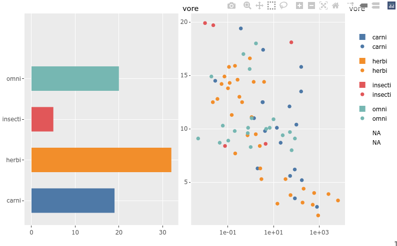
Legend interactivity
As we have seen before, we get zooming and interactive legends by default in plotly and if we put 2 plots together in a subplot they share an interactive legend (although with doubled glyphs in the legend). There is also a highlight function that can be used to drive non-legend based selection between two plots.
library(ggplot2)
library(plotly)
library(dplyr)

# animal_names <- selected_data[[1]] %>% purrr::map_chr('text')
p <- ggplot(msleep) +
    aes(y = vore,
        fill = vore) +
    geom_bar(width = 0.6) +
    ggthemes::scale_fill_tableau()
p1 <- ggplotly(p, tooltip = 'text') %>% layout(dragmode = 'select')

p <- ggplot(msleep) +
    aes(x = bodywt,
        y = sleep_total,
        color = vore,
        text = name) +
    geom_point() +
    scale_x_log10() +
    ggthemes::scale_color_tableau()
p2 <- ggplotly(p, tooltip = 'text') %>% layout(dragmode = 'select')

subplot(p1, p2)
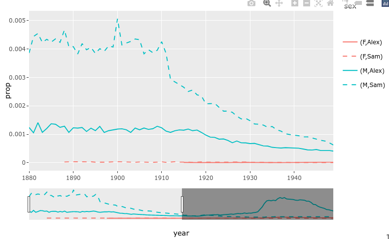
Rangeslider
There is a built-in function for creating a small plot (a rangeslider) that can be used as a zoom widget of the bigger plot.
library(babynames)
library(dplyr)
library(ggplot2)
library(plotly)

nms <- filter(babynames, name %in% c("Sam", "Alex"))
range_p <- ggplot(nms) +
    geom_line(aes(year, prop, color = sex, linetype = name))

ggplotly(range_p, dynamicTicks = TRUE) %>%
    rangeslider() %>%
    layout(hovermode = "x")
Animations!
Animations are easily created by passing a column to the frame aesthetic in ggplot.
library(plotly)
library(gapminder)


gap_p <- ggplot(gapminder, aes(gdpPercap, lifeExp, color = continent)) +
  geom_point(aes(size = pop, frame = year, ids = country)) +
  scale_x_log10()

ggplotly(gap_p)

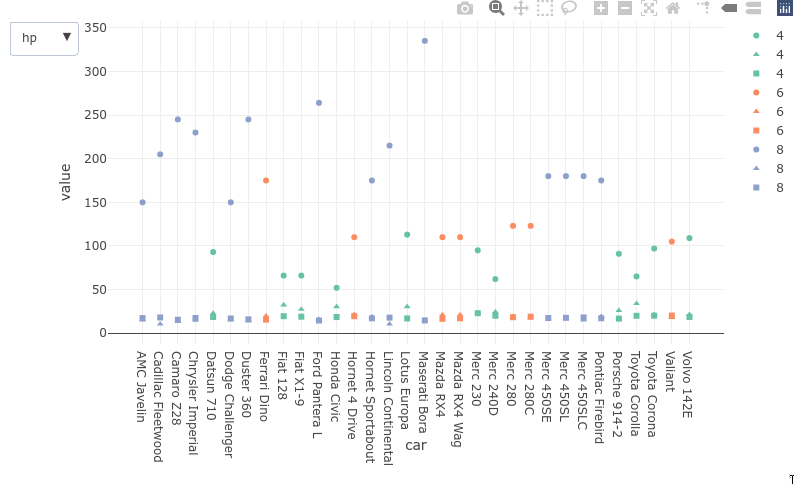
Dropdowns
Dropdowns are a bit verbose to use with plotly and they cannot be used with ggpltoly to dynamically query and filter the data as we saw with the Altair plots. They could be used to control properties of the plot aesthetics such as marker color or which column’s plot is shown, the same goes for sliders) here is an example of the latter with ggplotly:
Attribution
These lecture notes were prepared by Dr. Joel Ostblom, a post-doctoral teaching fellow in the UBC Vancouver MDS program.