Lecture 9 - Choosing an appropriate visualization & EDA
Announcements
Prepare for next week by requesting your free Tableau for Students License
Heads up:
Live lecture cancelled next week.
Approaching “end of Term crunch”! Stay on top of your deadlines!
Motivating the need for EDA
bullet_data.csv is available here: https://github.com/firasm/bits/raw/master/bullet_data.csv
import pandas as pd
import seaborn as sns
import numpy as np
import matplotlib.pyplot as plt

sns.set_theme(style="white",
              font_scale=1.3)
df = pd.read_csv('https://github.com/firasm/bits/raw/master/bullet_data.csv')
df.head()
| x | y | bullet | zone | |
|---|---|---|---|---|
| 0 | 0 | 0 | 0.0 | OutsidePlane |
| 1 | 0 | 1 | 0.0 | OutsidePlane |
| 2 | 0 | 2 | 0.0 | OutsidePlane |
| 3 | 0 | 3 | 0.0 | OutsidePlane |
| 4 | 0 | 4 | 0.0 | OutsidePlane |
# Use our standard tool first:

df.describe().T
| count | mean | std | min | 25% | 50% | 75% | max | |
|---|---|---|---|---|---|---|---|---|
| x | 87500.0 | 124.500000 | 72.168619 | 0.0 | 62.0 | 124.5 | 187.0 | 249.0 |
| y | 87500.0 | 174.500000 | 101.036462 | 0.0 | 87.0 | 174.5 | 262.0 | 349.0 |
| bullet | 68526.0 | 0.008741 | 0.093086 | 0.0 | 0.0 | 0.0 | 0.0 | 1.0 |
mmm… well that’s not super helpful. Let’s try and figure out some more info manually
print("The zones are: {0}".format(sorted(set(df['zone']))),"\n")

print("Columns are: {0}".format(list(df.columns)),"\n")

print("Values for 'bullet' column is {0}".format(sorted(df['bullet'].unique())),"\n")
The zones are: ['A', 'B', 'C', 'D', 'E', 'OutsidePlane', 'Unknown']

Columns are: ['x', 'y', 'bullet', 'zone']

Values for 'bullet' column is [0.0, nan, 1.0]
Let’s wrangle the data a bit to try and see what’s going on:
# First, only consider the bullet 'hits':

hits_df = df[df['bullet']==1]
hits_df.sample(5)
| x | y | bullet | zone | |
|---|---|---|---|---|
| 36570 | 104 | 170 | 1.0 | B |
| 80687 | 230 | 187 | 1.0 | E |
| 26037 | 74 | 137 | 1.0 | B |
| 31984 | 91 | 134 | 1.0 | B |
| 42544 | 121 | 194 | 1.0 | D |
# Then, let's groupby the "zone" and look at the resulting dataframe
# I have "reset" the index of the groupby object so we can have a continuous index
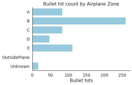
summary = hits_df.groupby('zone').count().reset_index()
summary
| zone | x | y | bullet | |
|---|---|---|---|---|
| 0 | A | 83 | 83 | 83 |
| 1 | B | 259 | 259 | 259 |
| 2 | C | 83 | 83 | 83 |
| 3 | D | 47 | 47 | 47 |
| 4 | E | 111 | 111 | 111 |
| 5 | Unknown | 16 | 16 | 16 |
# Now let's visualize the table above:

sns.countplot(data=hits_df,
              y='zone', order = sorted(set(df['zone'])),color='skyblue')
plt.ylabel('')
plt.title('Bullet hit count by Airplane Zone')
plt.xlabel('Bullet hits')
sns.despine()
df['outline'] = np.where(df['zone']=='OutsidePlane',0,1)

sns.heatmap(data=df.pivot('x','y','outline'),cmap='Greys')
plt.axis('off')
(0.0, 350.0, 250.0, 0.0)

sns.heatmap(data=df.pivot('x','y','bullet'),cmap='Spectral')
plt.axis('off')
(0.0, 350.0, 250.0, 0.0)

## Visualization